Reliance Matrix Claims Portal (Product Design)
Overview

About Reliance Matrix
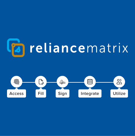
Reliance Matrix's mission is to digitize and accelerate existing HR & Benefits business processes from paper-first to data-first, through cutting edge technology and world-class user experiences.
Claims at Reliance Matrix
When I arrived at Reliance Matrix, the existing process for filing a claim was primarily paper-only. It took customers weeks to file a claim. One of the biggest initiatives on the roadmap, was to modernize and digitize the entire claims process.
Problem
The insurance claims process was inefficient and cumbersome, relying entirely on a paper-based system. This approach caused delays in claim processing, increased errors, and added frustration for users navigating a complex and opaque process. Claimants lacked visibility into their claim status, and struggled to manage and track claims effectively. There was a critical need to modernize the process by digitizing it, improving accessibility, and enhancing the overall user experience for claimants.
Goal
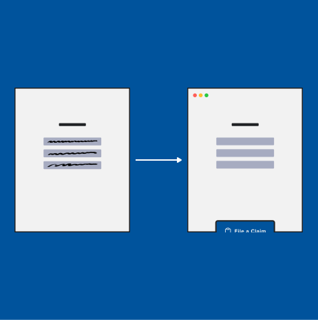
Digitize the insurance claims process by creating an intuitive online portal where claimants can effortlessly file claims, track their progress in real-time, and initiate appeals. The solution aims to streamline the experience, reduce complexity, and empower users with greater transparency, visibility, and control over their claims journey.
Project Details
Year: 2023-2024
My Role: Director of Product & Design
What I did: Product Vision, Product & Design Strategy, Executive SteerCo, Prototyping
Scale: 1MM+ Users
Research
Research strategy
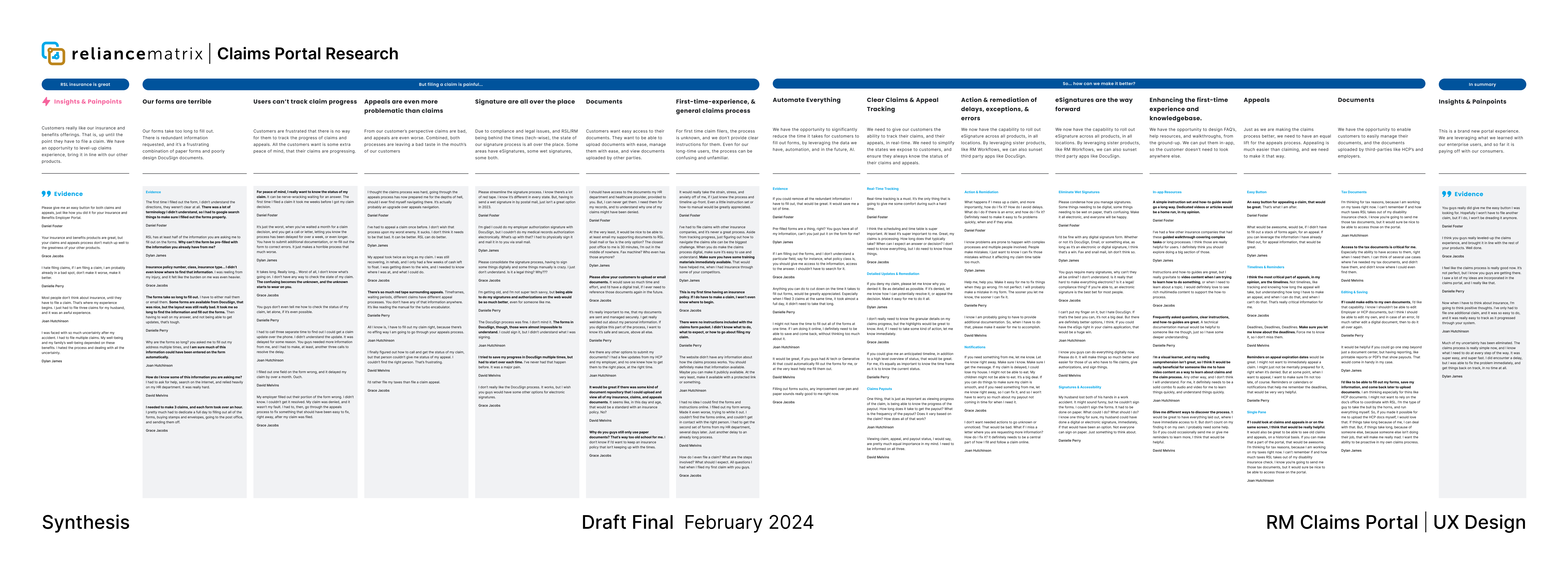
- I led recruiting, planning, facilitation, and synthesis of 20 research sessions, over a period of one month, to understand the existing claims process, end-to-end customer touch-points, and opportunities for digitization, optimization, and automation. I talked to users across the country, from small businesses all the way through our largest enterprise clients. I also met with, and conducted focus groups with internal Benefit Operations staff to understand how they facilitate the claims process, and find potential opportunities to streamline the internal approach.
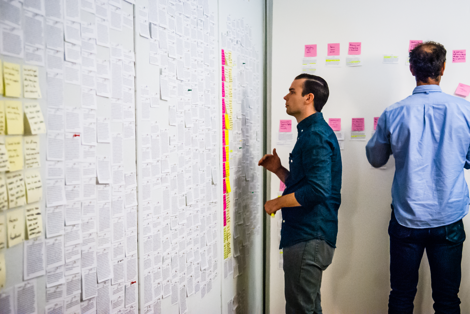
25 Participants | 5 Global offices
- I recruited participants based on a variety of factors, like: client segment, demographics, geographic location, policy type, past claim complexity, past claim history, and tech savviness, ensuring to get a diverse representation of our user-base, including those with disabilities. This gave me a well-rounded idea of all the nuance associated with our insurance claims process.
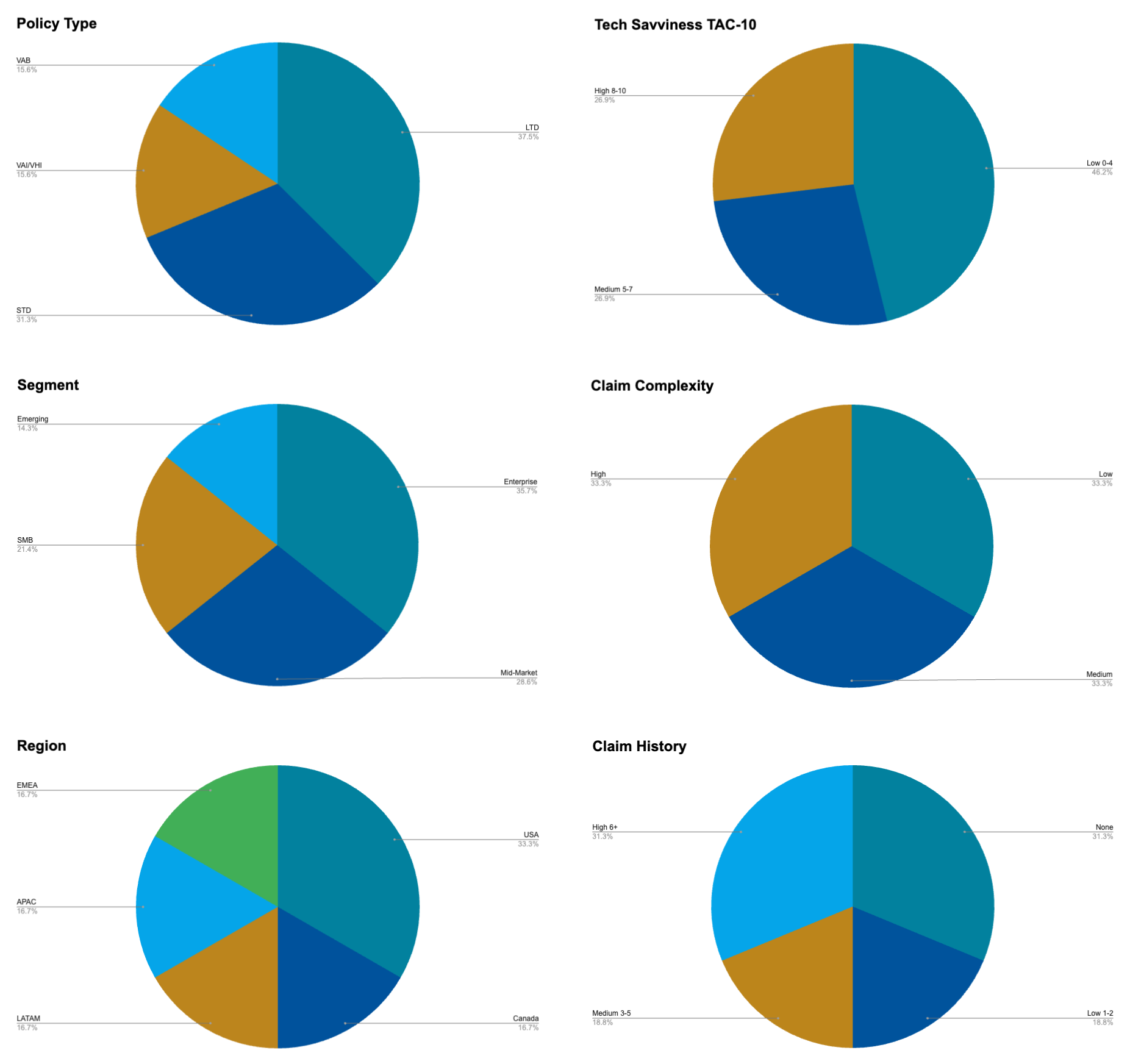
Research synthesis -> 25 participants over 5 global offices
Research
Existing Workflow
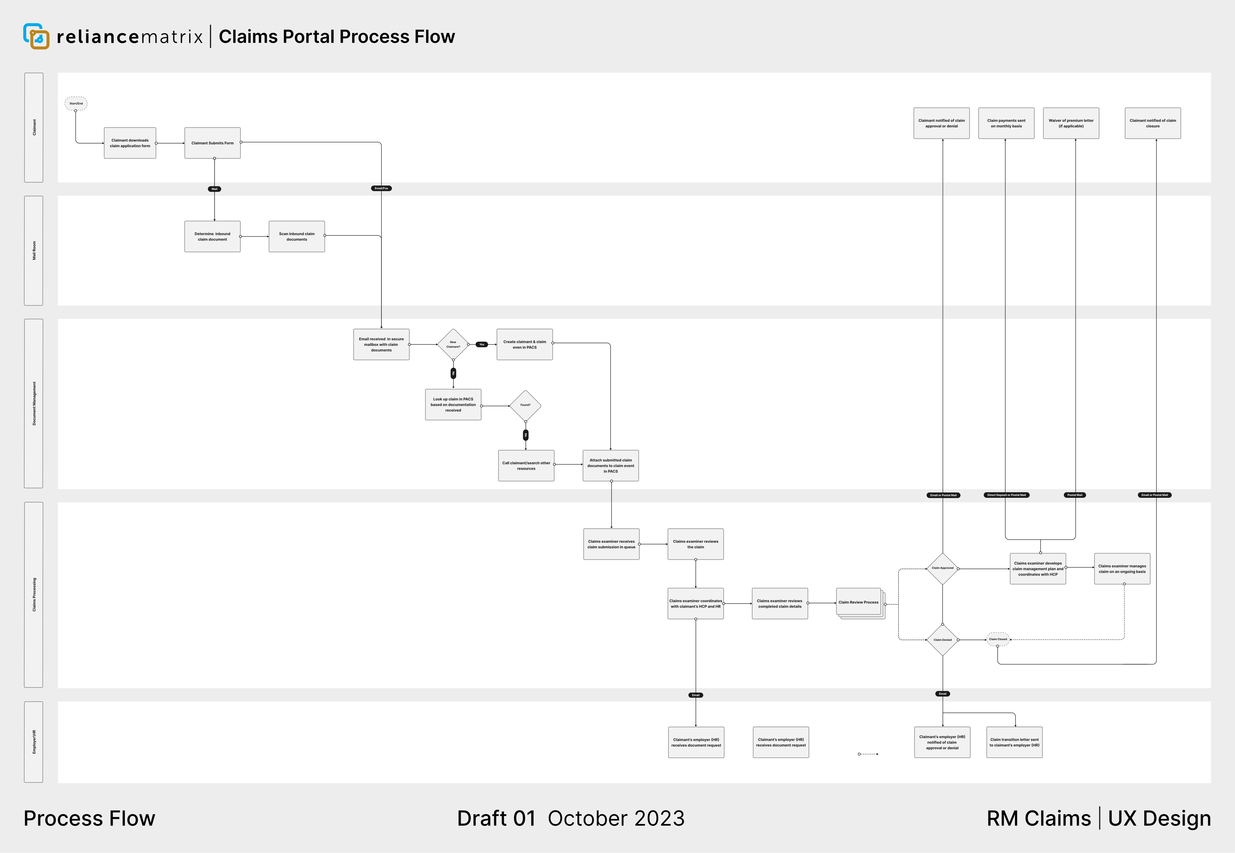
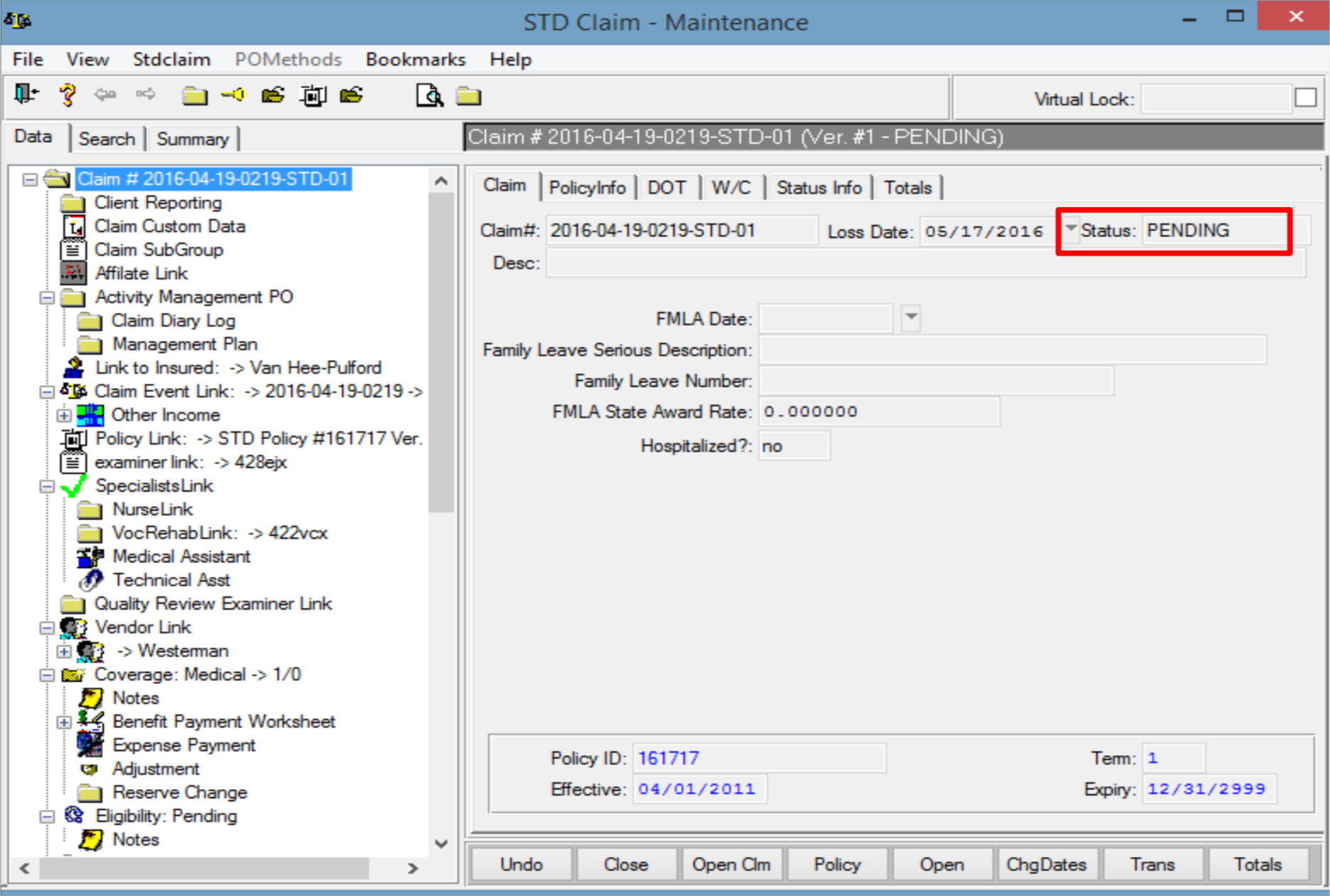
Since the goal is to digitize a primarily paper-driven process, as part of the initial research, I wanted the team to study the existing claims process, and know it in-depth. As a starting point, I worked with the internal operations team to map out the existing claims process and journey, and presented it to my team.
Step 1
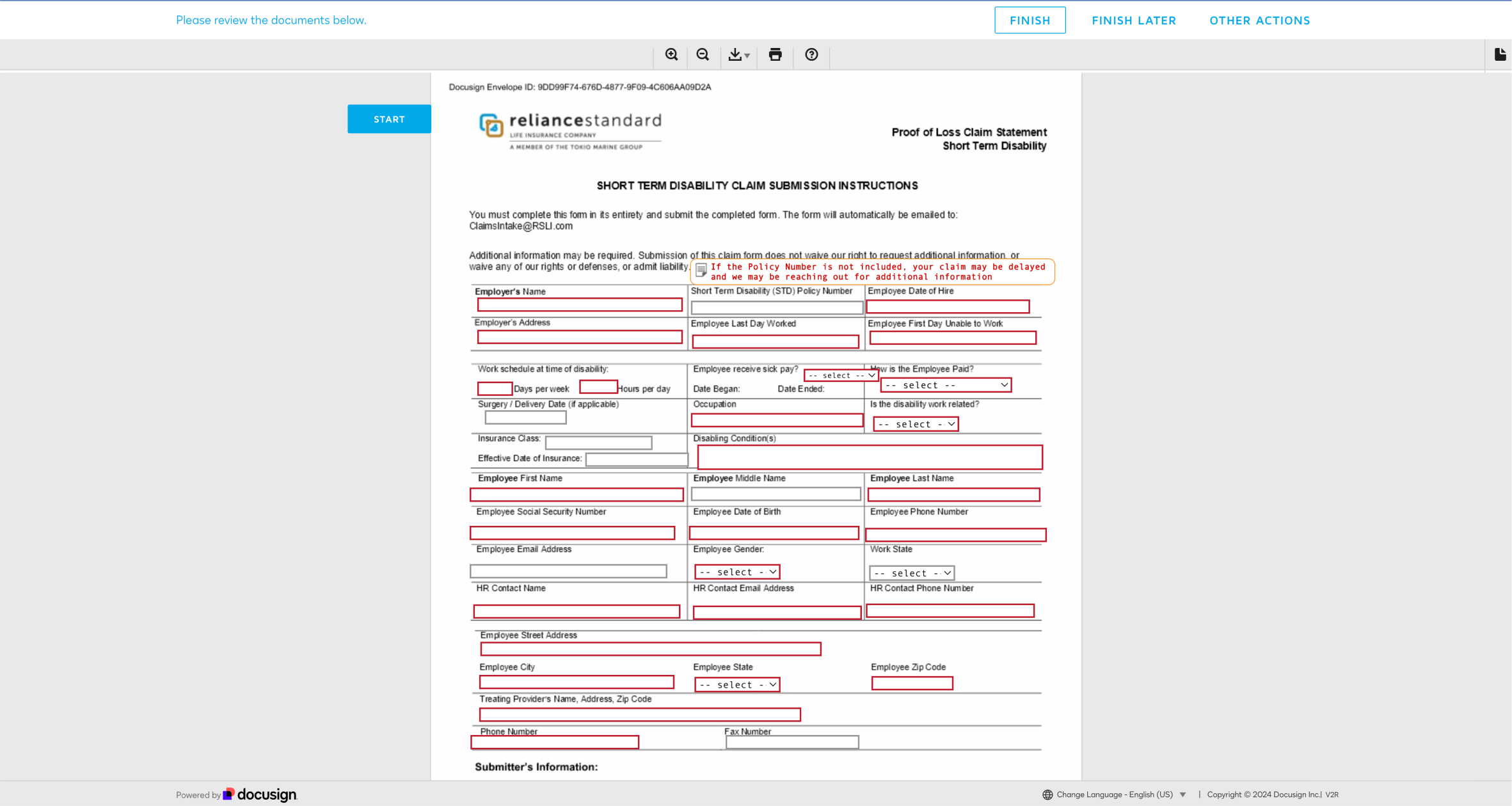
Claimant eSigns or paper fills form
Step 2
HR & Health Care Provider eSigns or paper fills form
Step 3
Reliance Matrix internal processing
Step 4
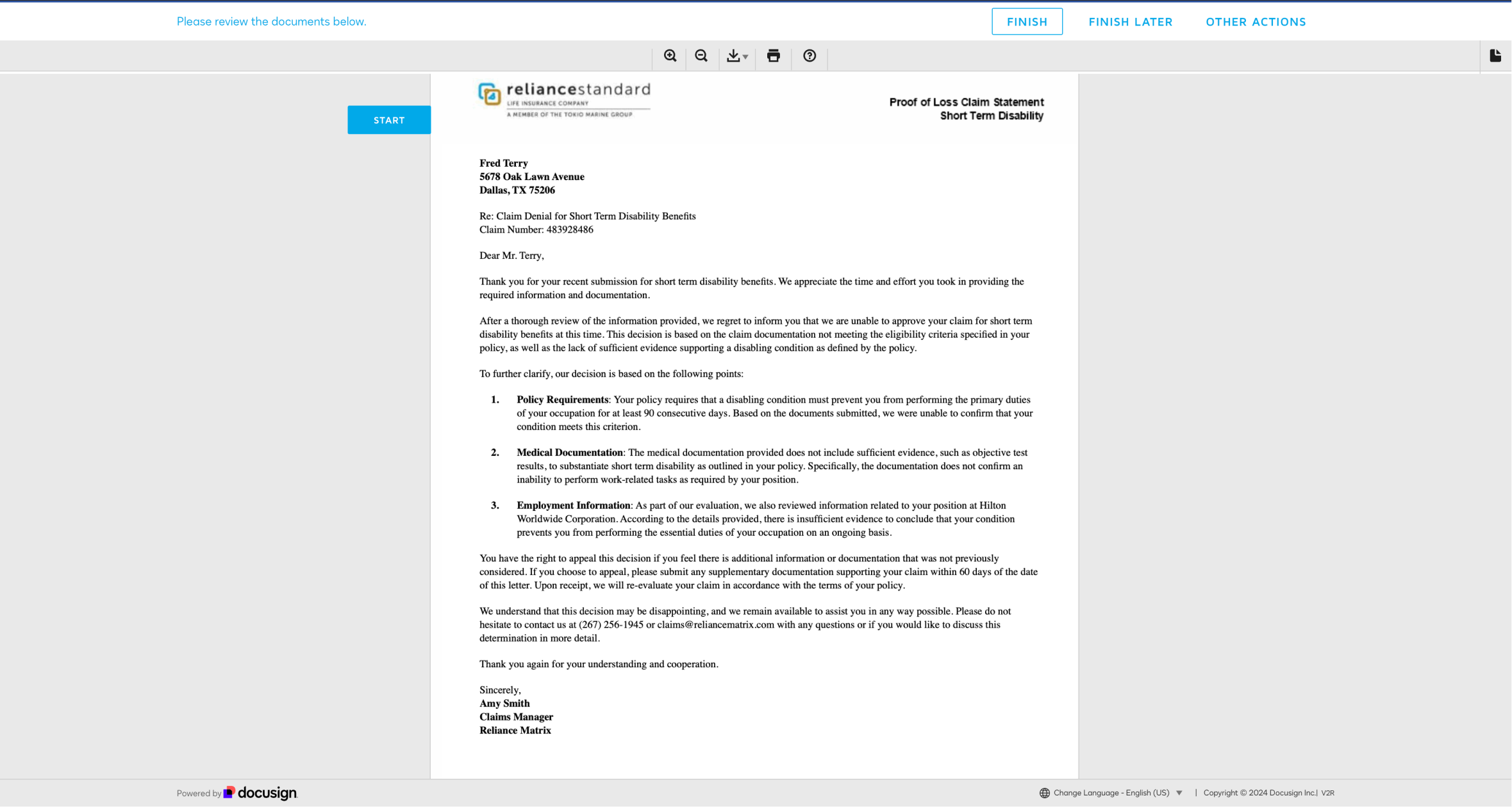
Claimant receives notice of claim decision
Research
Dylan, Enterprise Claimant
For this case, I am going to showcase the design through the Lens of Dylan, a Delivery Driver from one of our largest Enterprise clients.

Dylan James
About
Dylan is a Delivery Driver at one of our largest enterprise clients. He sustained a non-work-related injury. He fractured his spine while rock climbing with his wife. His severe spinal injury will impede his ability to perform his daily job functions, for at least the next 9-12 months. In order to ensure he has enough money coming in to support his family, he will need to file both short-term and long-term disability insurance claims.
Motivations
• Knowing the claims process up-front.
• Easy to fill out forms.
• Being "in the know" about the state of his claim.
• Easy to use claims platform.
Pain points
• Navigating the process while in a reduced physical & mental state.
• Filling out long forms with hard to understand terminology.
• Not knowing the claims process up-front.
• The uncertainty of not being able to track the state of his claim.
Research
Pain Points

Unclear instructions
“I didn’t understand how to file my claim. Was there an online portal? Did I need to fill out paper documents for my claim? What steps should I expect?”

Lengthy forms
“The forms are long, really long. I had multiple claims to file, and it took hours. I was still recovering from my injury, so I had to put much of the burden on my wife to fill out the crazy forms for me.”

Difficult terminology
“Not only were the forms long, but all throughout the process, I didn’t understand much of the terms and what was being asked of me.”

Difficult claims tracking
“The worst problem of all is not being able to track my claim’s progress. The unknown is nerve-wracking. I didn’t know where I was in the process, how long it would take.
Research
Opportunities

How might we ensure the users know the process up-front, in the clearest, most intuitive way possible?

How might we leverage technology and automation to cut down on the amount of time it takes users to fill out the forms?

How might we ensure the user can understand the complex, and often foreign terminology used in the claims process?

How might we establish trust and visibility with users at each stage of the claims process, enabling users to track progress from end-to-end?
Design Process
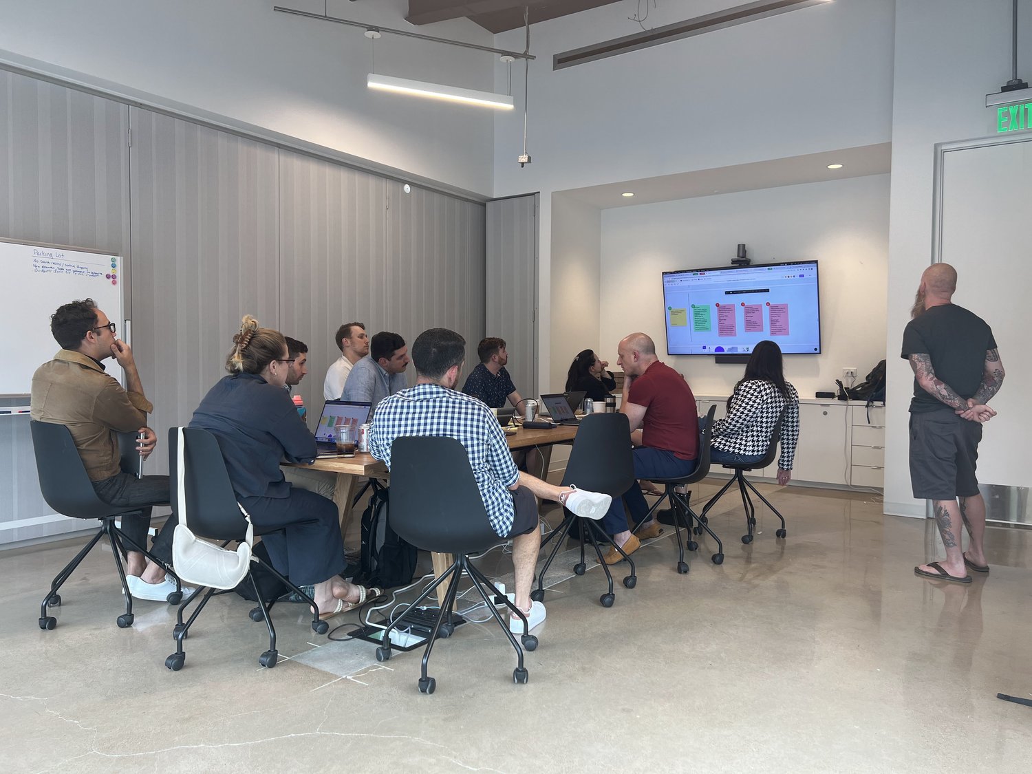
Taking what we learned from research, I kicked off the design process by leading a cross-functional design thinking session. I gathered Product, Design, Engineering, Ops leaders, along with Business stakeholders. The goal of the session was to co-create a northstar vision for the claims portal, while ideating upon the previously defined opportunity statements.
Validation > strategy > prioritization
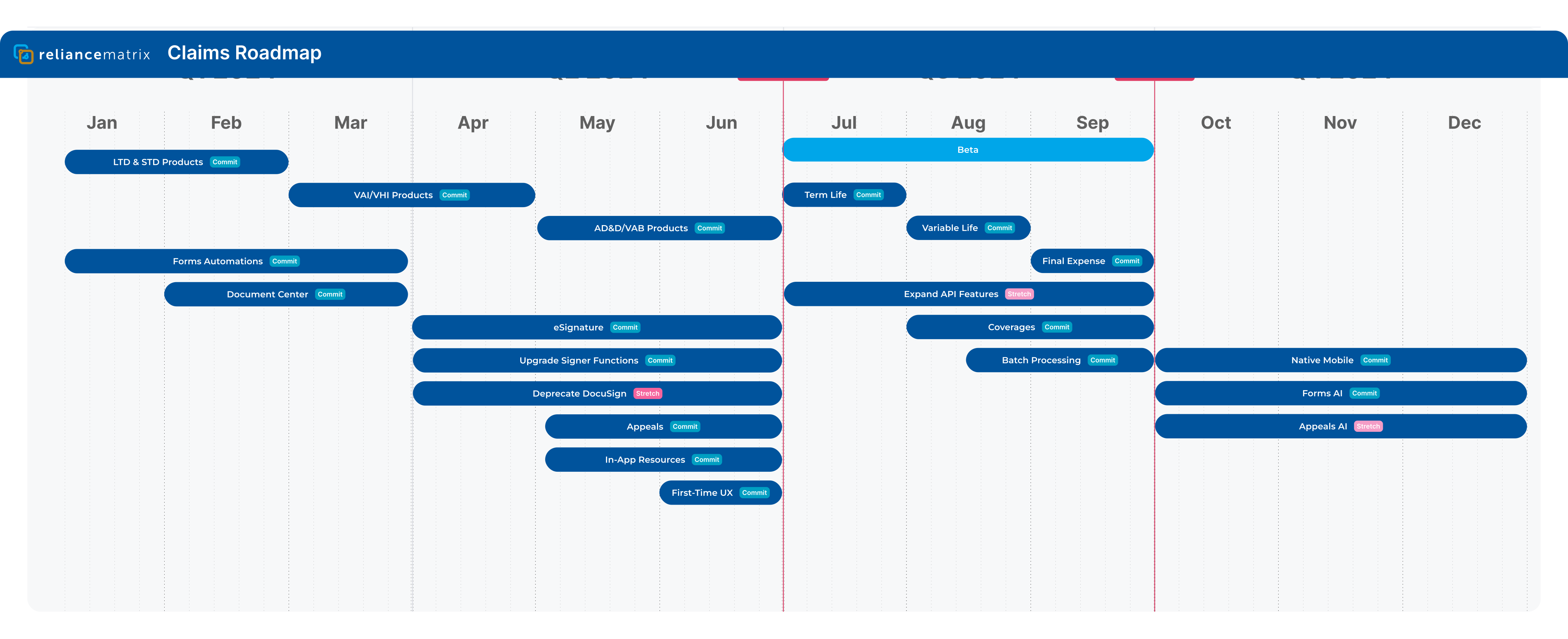
After validating our sprint ideas with users, I presented to senior leadership, on multiple occasions, to gain buy-in on the long-term product vision. Then, my strategy was to narrow in on an MVP, merge disparate touchpoints into a unified claims workflow, sunset external tools like DocuSign, and build a foundation for claims workflow visibility to support automation and future AI initiatives.
Prototype
We launched a study, with 5 participants, testing two separate prototype iterations. These two prototype tests shaped our initial design concepts into a viable, engineering-ready design.
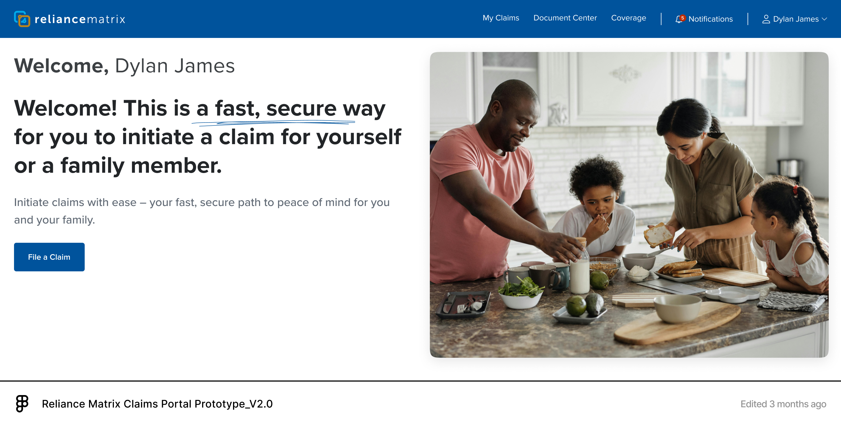
Second of two early prototypes tested with initial participants
Prototype Feedback
Progress Indicator
Based on feedback from the two prototype tests, users wanted a more comprehensive way to visualize both claim status and claim progress. Before we started designing the progress indicator, I needed to map out all of the different claims states and statuses, so my team had the right information needed to begin the design.
Mapping claim states and statuses
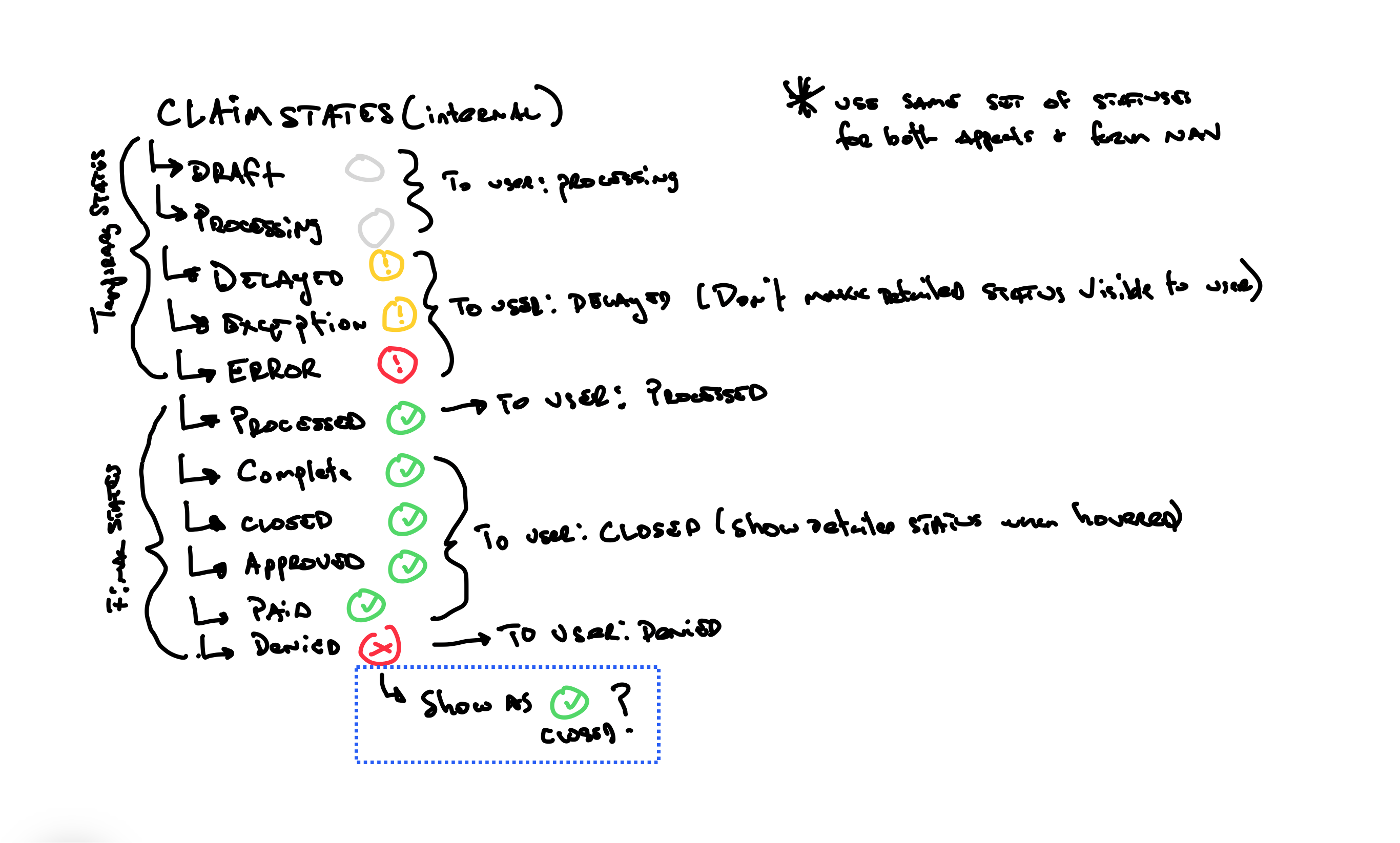
There are over 25 internal claim states, which would be confusing for the user to understand. The internal states needed to be decoupled from the states exposed to the user. I grouped them into 4 simple, easy to understand categories which could be exposed to the user via the progress indicator.
Progress indicator iterations
I established the following guiding design principles: establishing a clear visual hierarchy, simplifying complex statuses with informative labeling, and providing clear feedback on ongoing processes.
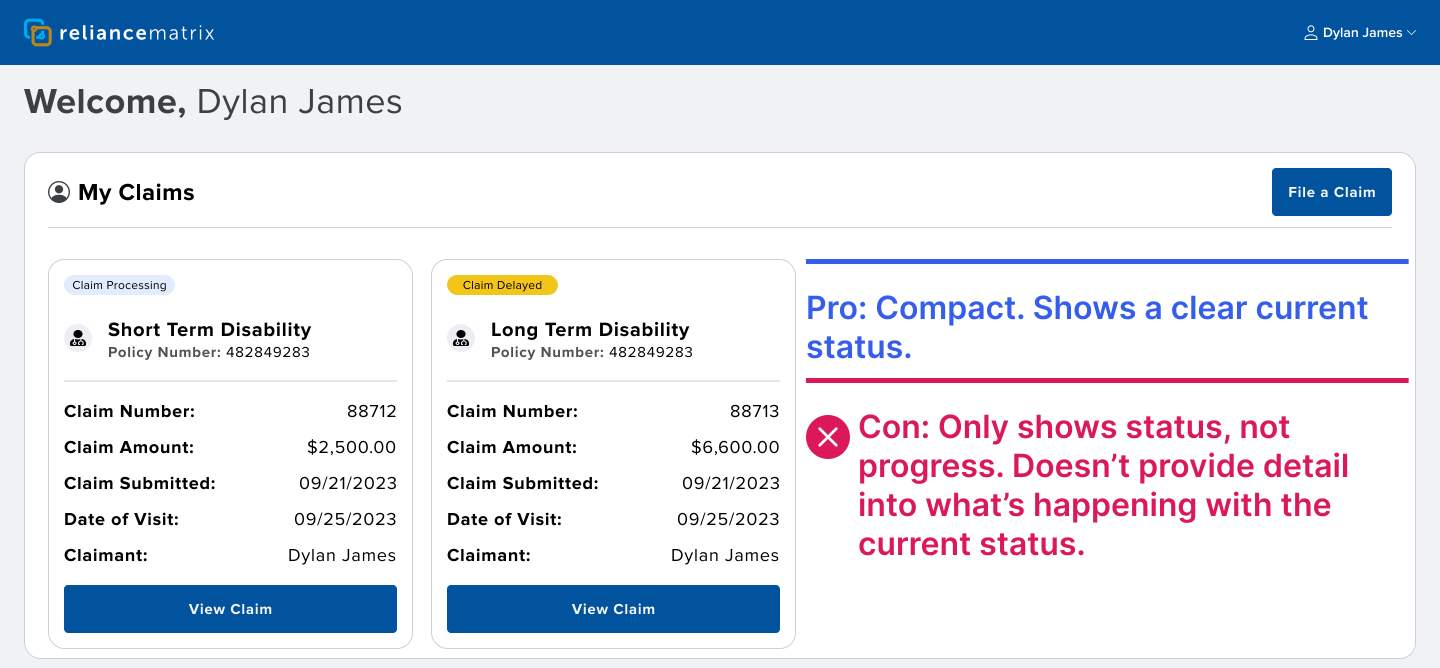
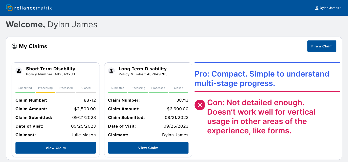
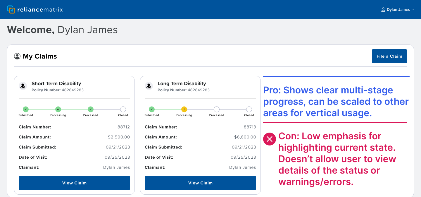
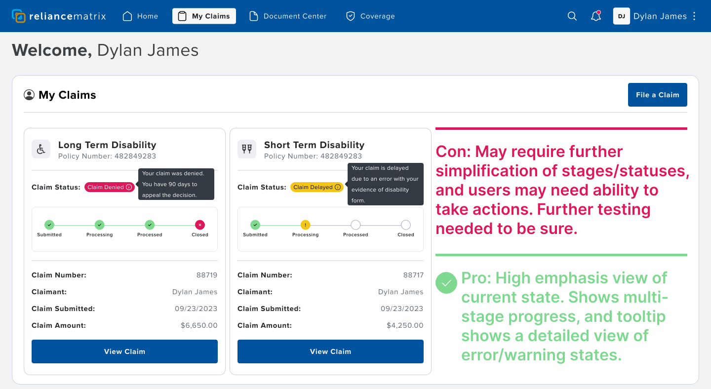
The winner, based on testing, uses a chip design with tooltip. The chip design uses color for emphasis & categorization, to display the current state, and the tooltip provides a detailed view of error and warning states. The progress indicator breaks the claims progress into 4 stages: Submitted, Processing, Processed, and Closed. At this point, this was the best design, but further testing would still be needed for additional validation and refinement.
Prototype Feedback
Form Navigation
Another action item, from the second prototype, users needed to view their progress, as they worked their way through filling out the claims forms. The new form navigation needed to support progress visibility through the claims forms process, ensuring users can maintain their progress if they leave and come back. To set the stage for form navigation, I started by mapping out the user flow for each policy type, so my team had the proper context for each.
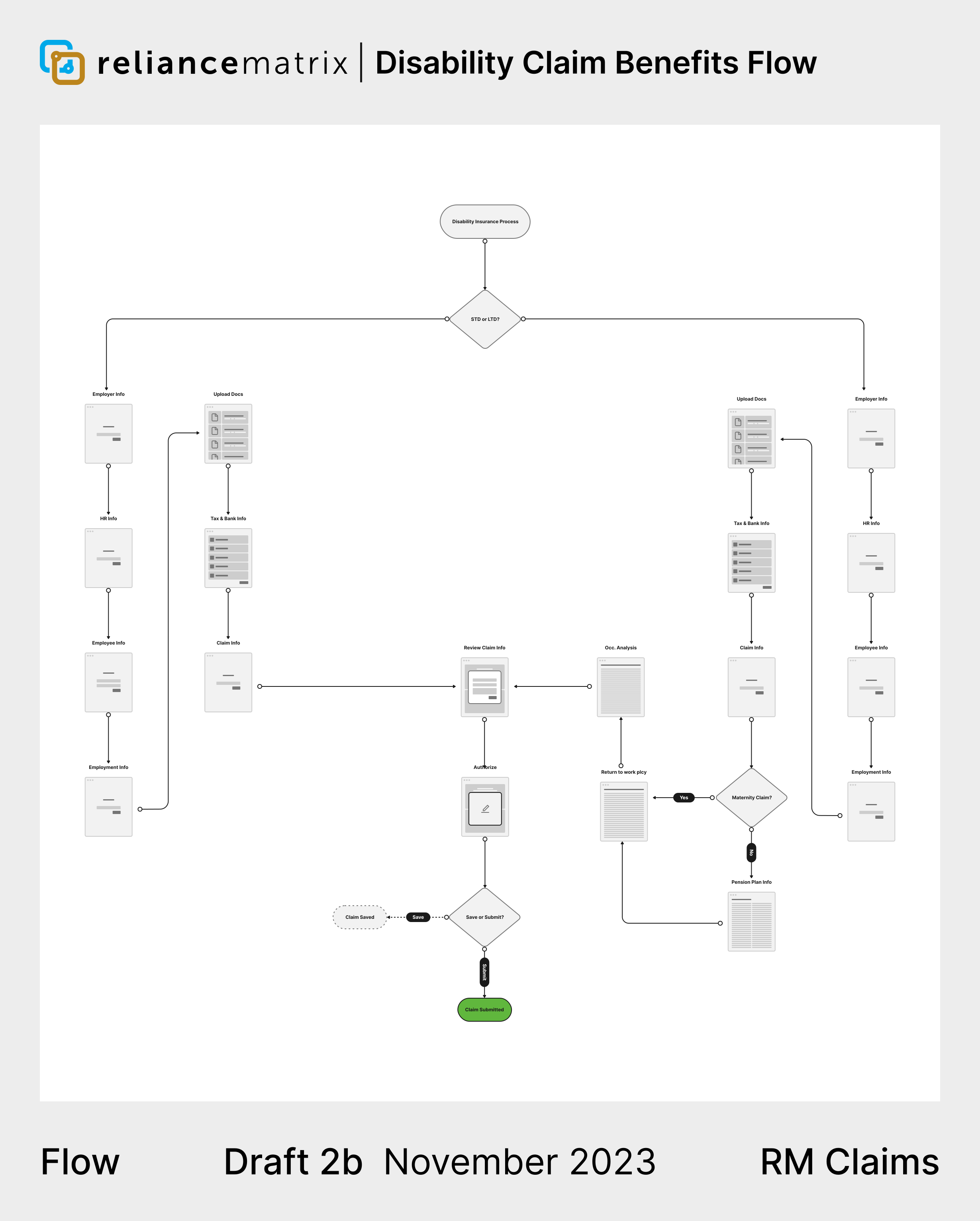
Form navigation iterations
I set the guiding design principles as: establishing a clear visual and information architecture, maintaining consistency in design patterns, and providing clear feedback on ongoing processes.
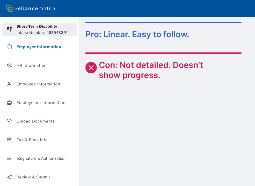
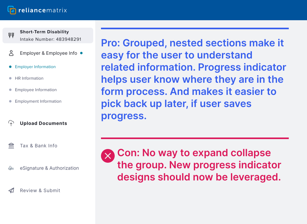
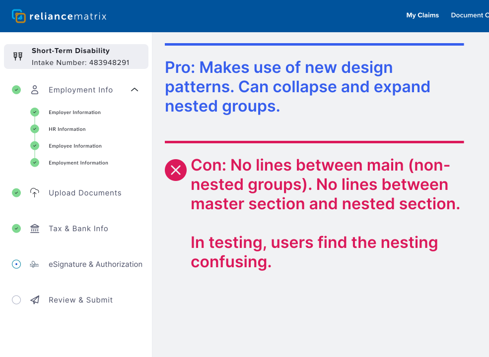
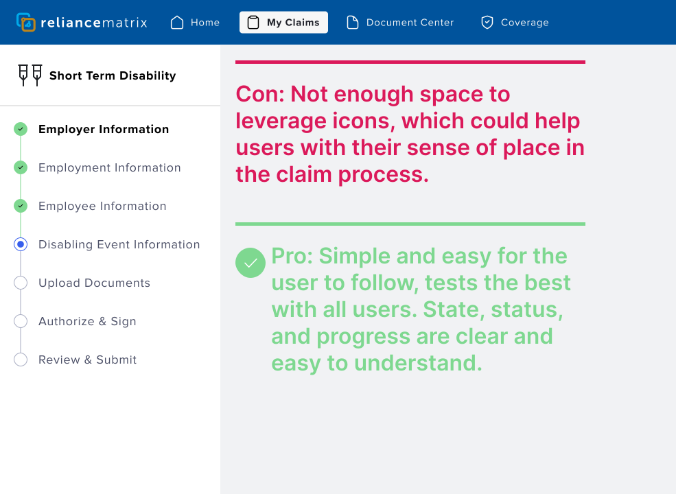
The winner, again, based on user testing, leverages the same progress indicator design pattern from claims tracking, making it vertical. In testing, users found this design intuitive, simple, and easy for to follow, especially when coming back to complete a saved claim.
Prototype Feedback
Form Automation
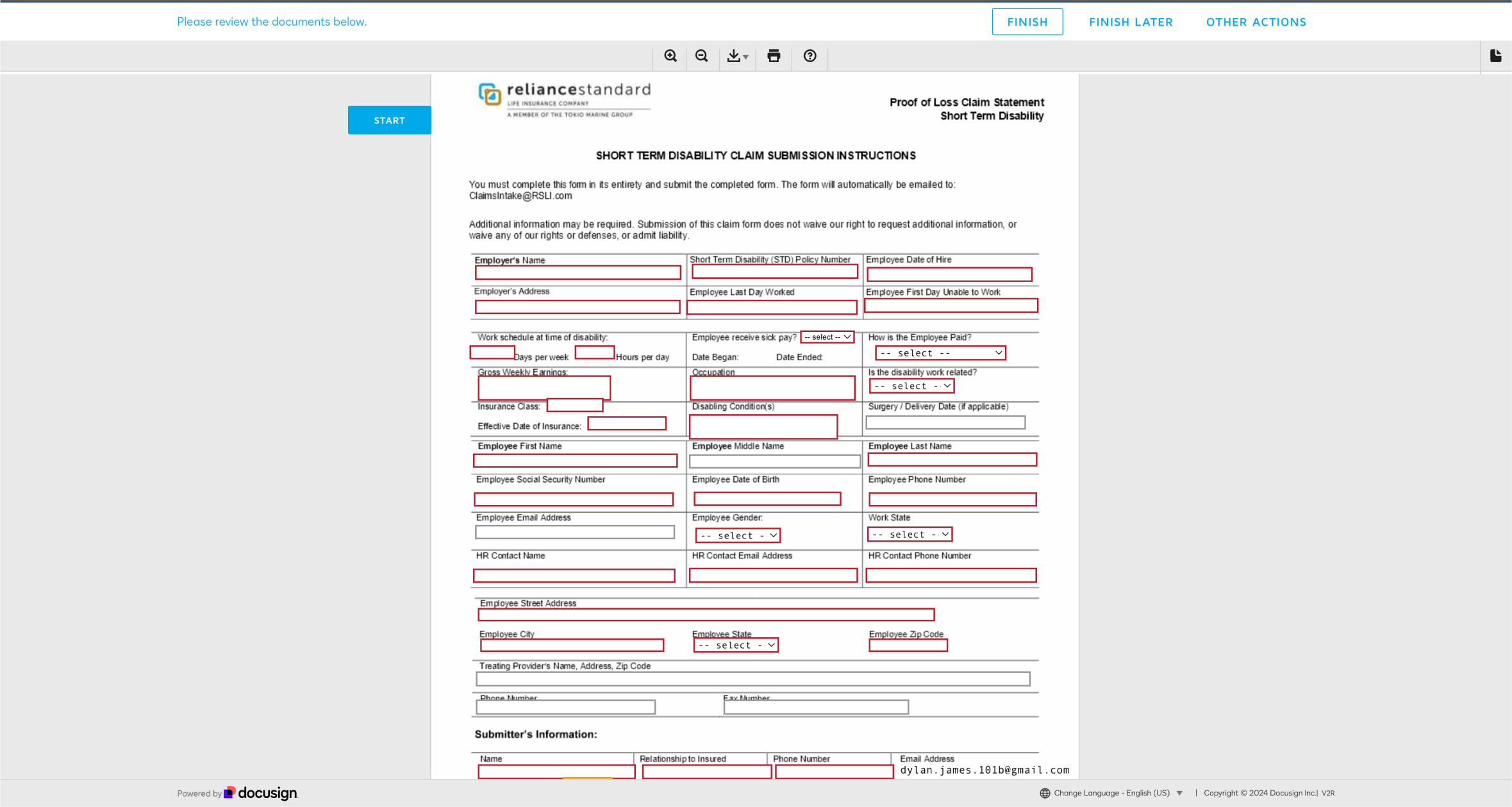
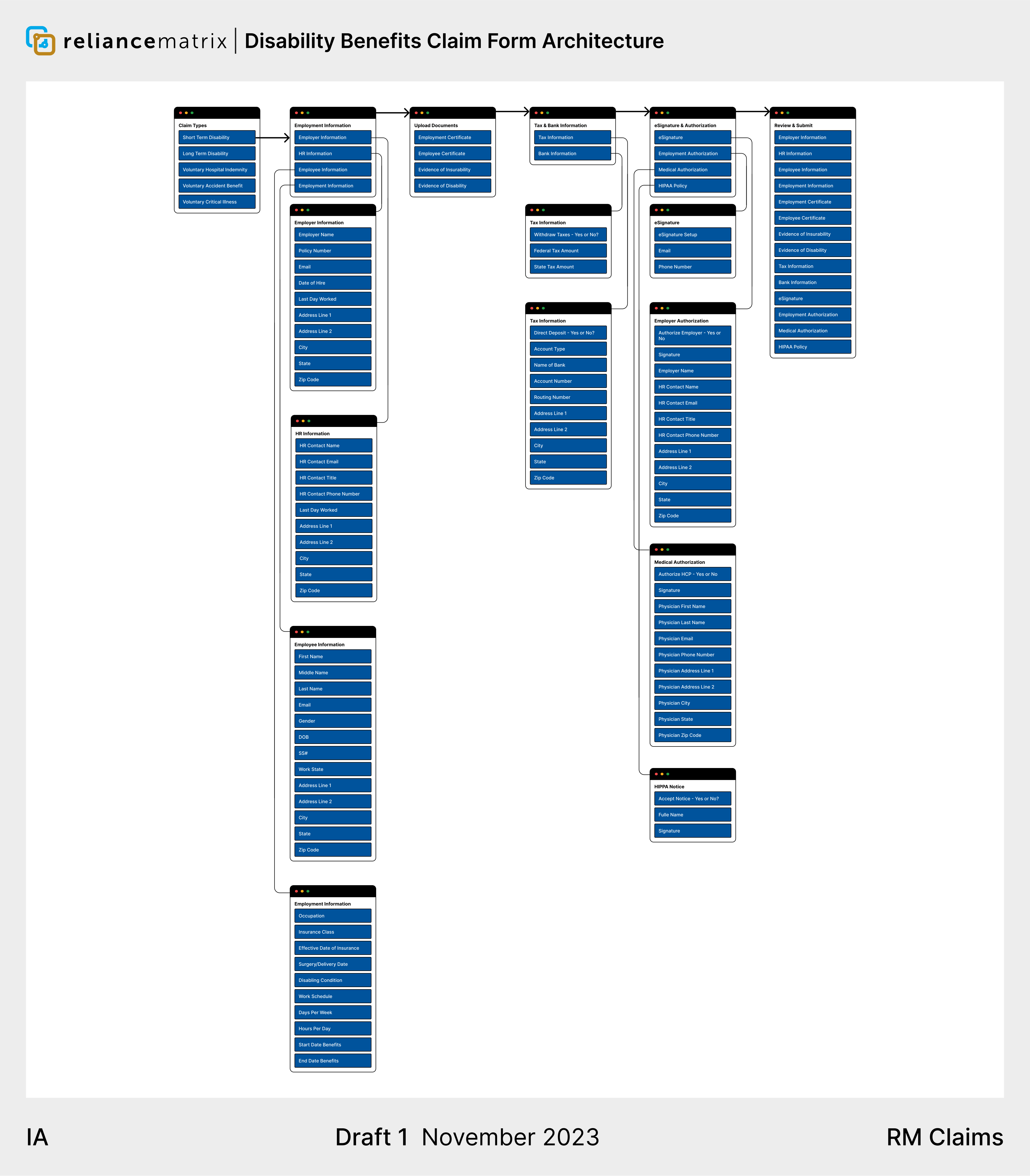
Based on initial research and prototype feedback, users felt the forms were too long, struggled to understand why they needed to provide information Reliance Matrix already had, and didn't understand many of the terms on the form. By the time we were ready to design for the beta launch, Engineering and Data Science had the tech stack ready for form automation. To get started with the form designs, I mapped out the information architecture for each benefit and policy type.
74 Fields | 0 Pre-filled fields | 30m to complete
State of the forms before Claims Portal
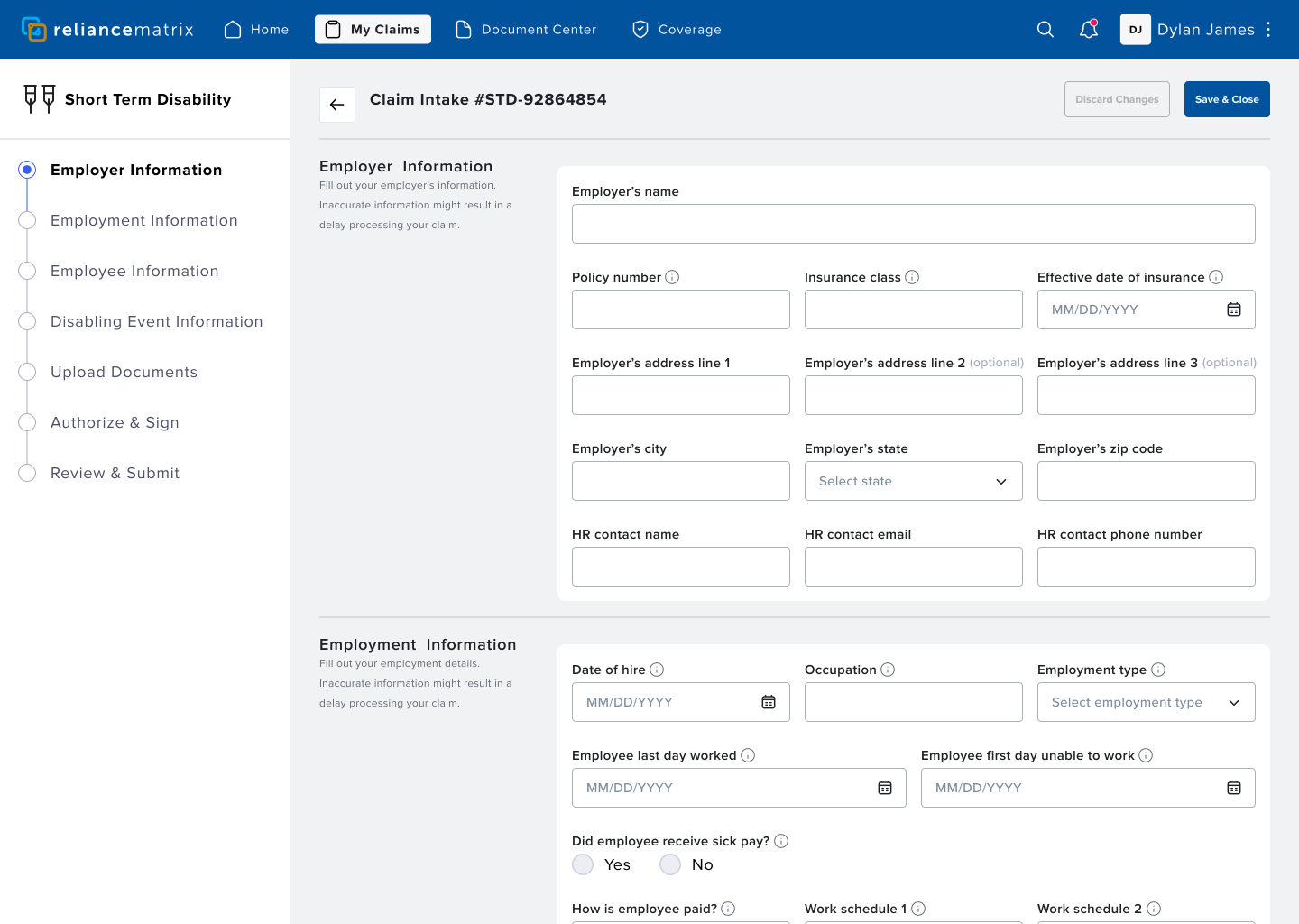
70 Fields | 0 Pre-filled fields | 15m to complete
First iteration of Claims Portal
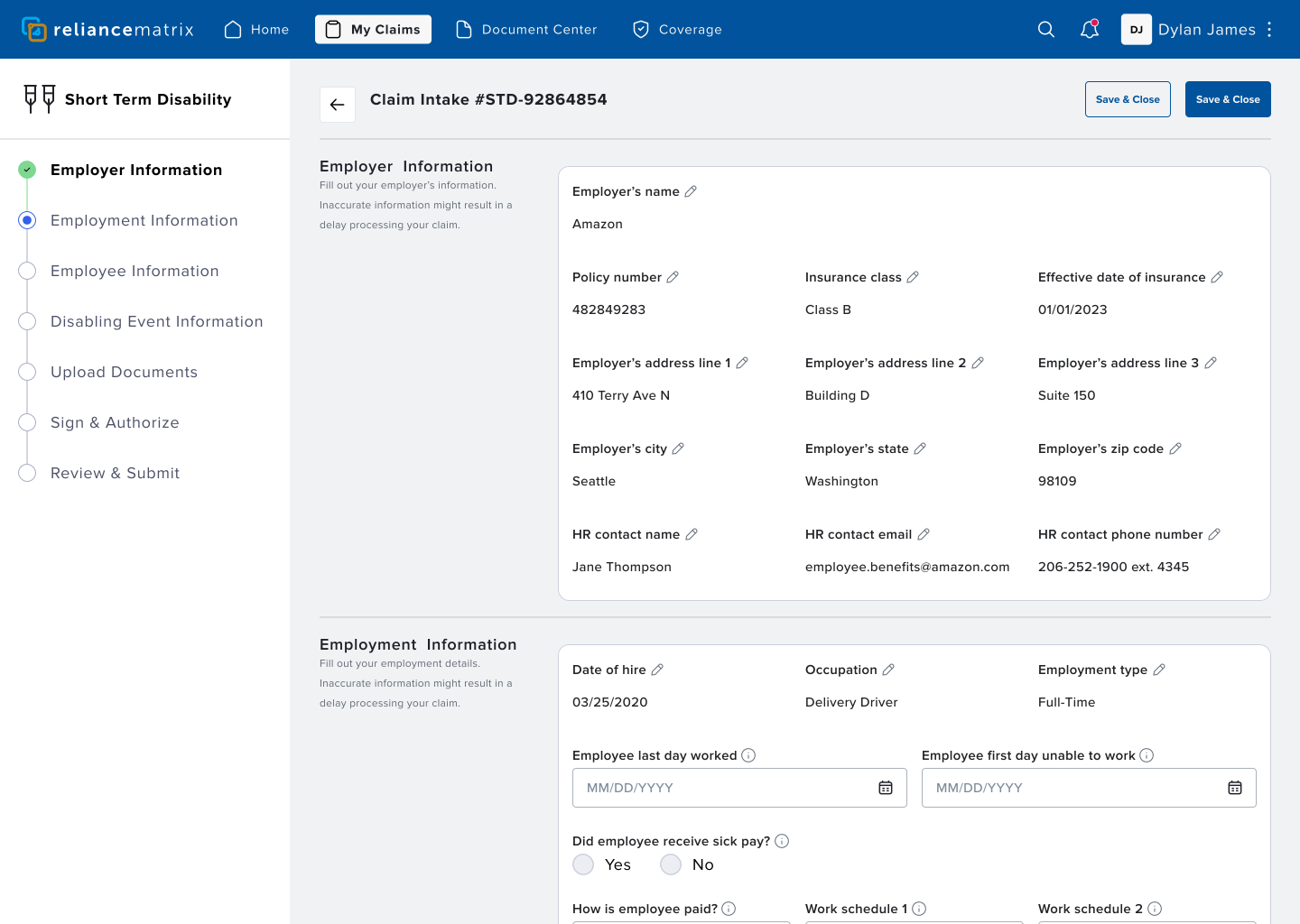
65 Fields | 35 Pre-Filled | <5m to complete
Final iteration of Claims Portal with automation. Fewer fields and 83% faster to complete.
The guiding principles: deduplicate information, leverage automation to pre-fill forms, and lessen the complexity of understanding unfamiliar information and difficult terminology. I ensured users have the ability to edit the pre-filled information, in the case any of it is incorrect. To support users understanding of fields and difficult terminology, I made sure we added tooltips to all of the input fields, so users always know what's being asked of them.
Prototype Feedback
Notifications
Notifications are an important part of how users are informed about the current state of their claim. After the second prototype test, users asked for a more robust way to be informed about delays in the claims process, and an intuitive way to resolve delay-related issues that prevent the claim from progressing.
Notification iterations
I established the guiding principles as: attend the user, prioritize critical notices, inform the user on context, and enable the user to easily act to resolve.
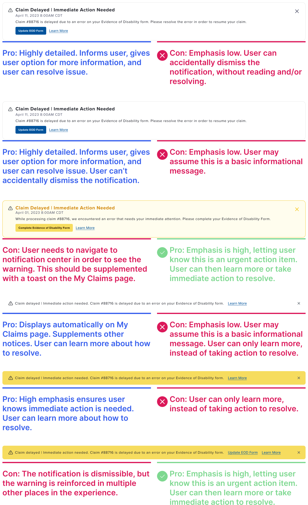
The winning strategy, at this stage, based on testing and user feedback, was to use a combination of toast notifications on the dashboard, and full notification cards, in the notification center. However, supported by user feedback, I still felt like further testing and validation would be needed to ensure the users had the best notification strategy. The upcoming Beta would give us the opportunity for this further testing and validation.
Toast notification deployed on dashboard
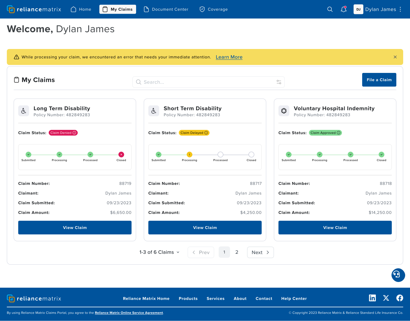
Deployed on the dashboard, the toast notification draws the user's immediate attention, informs about the issue context, gives the user the option to learn more, or immediately resolve the issue.
Notification Center
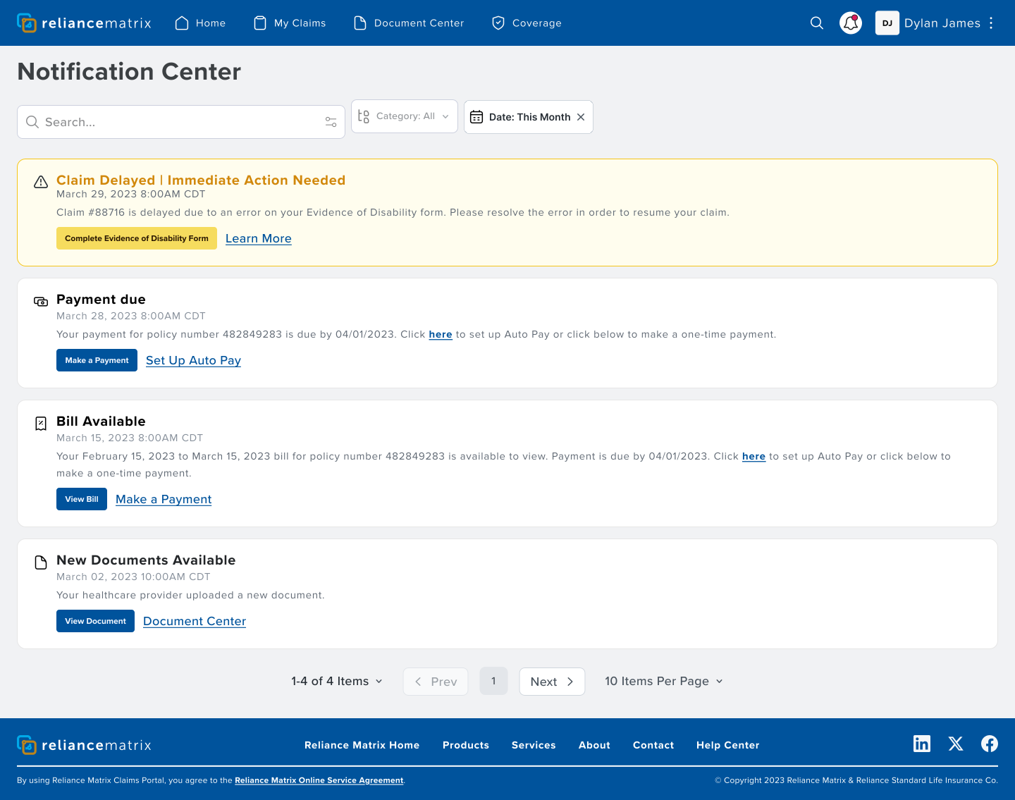
If the user dismisses the toast notification, they still have the ability to view and resolve the issue from the notification center, ensuring the user can always take action to keep the claims process proceeding forward.
Validate & Refine
Beta Feedback
Once the beta launched, I made sure we had real-time data collection, surveys, and a feedback form, from our beta users, which gave us new high value user insights. To dive deeper into these insights, I led an additional study, consisting of 10 users.
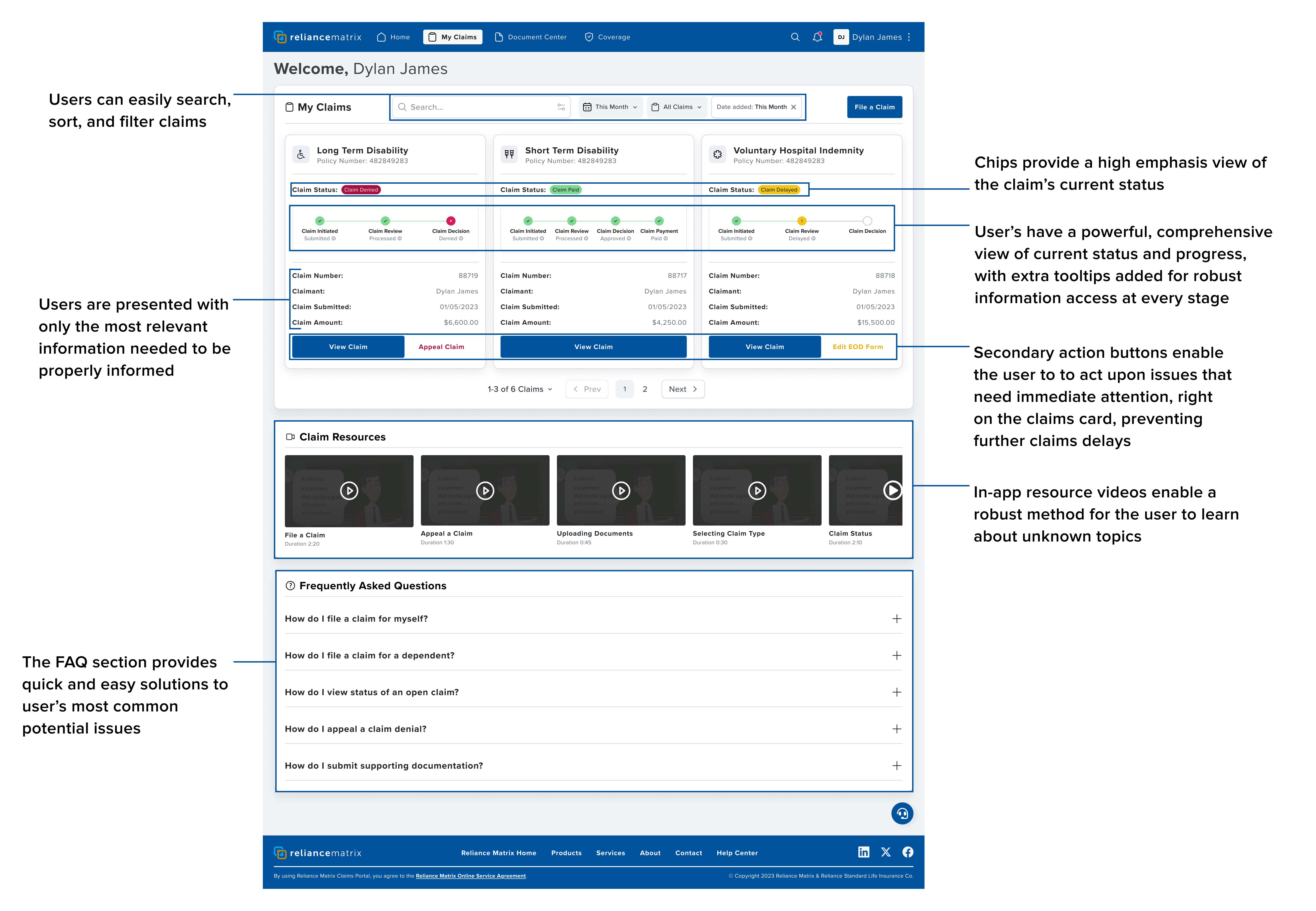
The primary takeaway from the beta feedback was that the experience was really good, clear, and intuitive. But, there were a few additional things users needed: simplification of claims states, additional layers of visibility into claims progress, clearer steps to take action to resolve issues, visibility into claims payout status, quicker access to notifications, and more robust in-app help resources.
Simplifying claim states, and increasing progress visibility
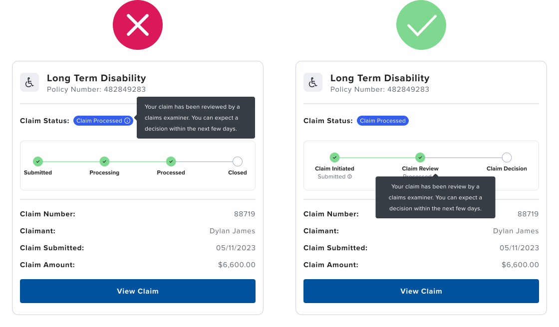
Solution: The final solution simplifies the steps in the progress indicator, establishing 3 primary stages: Initiated, Review, and Decision. This enables multiple statuses to be included under each stage. I moved the tooltip from the Claim Status Chip to the progress indicator so the user has a more detailed view of current status and progress through the stages.
Easily taking action
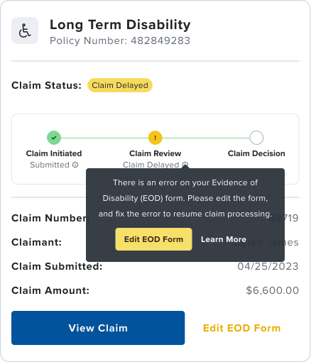
Solution: I ensured we added action buttons to the tooltips, and secondary action buttons to the claims card, so the user has even more ways to resolve and remediate any issues that may arise.
Appealing a denied claim
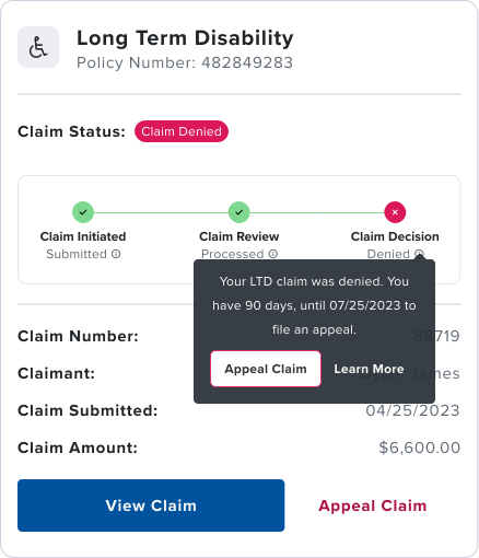
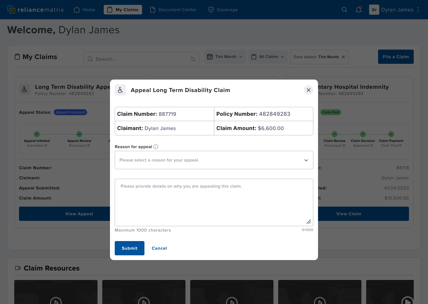
Solution: For claim appeals, I also ensured we added secondary action buttons to the claims card and tooltips, and the tooltip shows the user how long they have to appeal the claim decision.
Viewing payout status
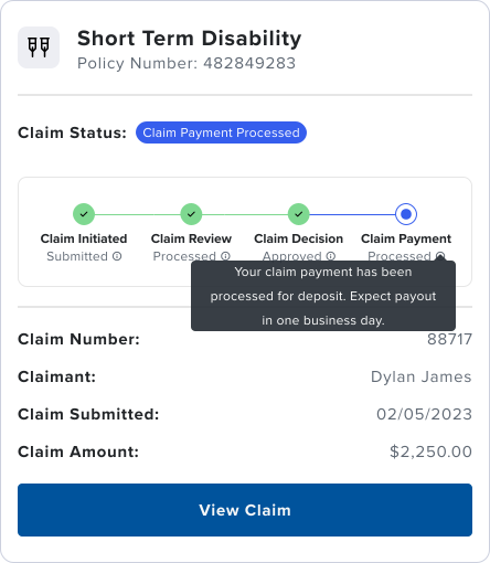
Solution: Once a claim is approved, we added an additional step in the progress indicator that shows payment status, again with tooltips that shows the user what to expect.
General Availability
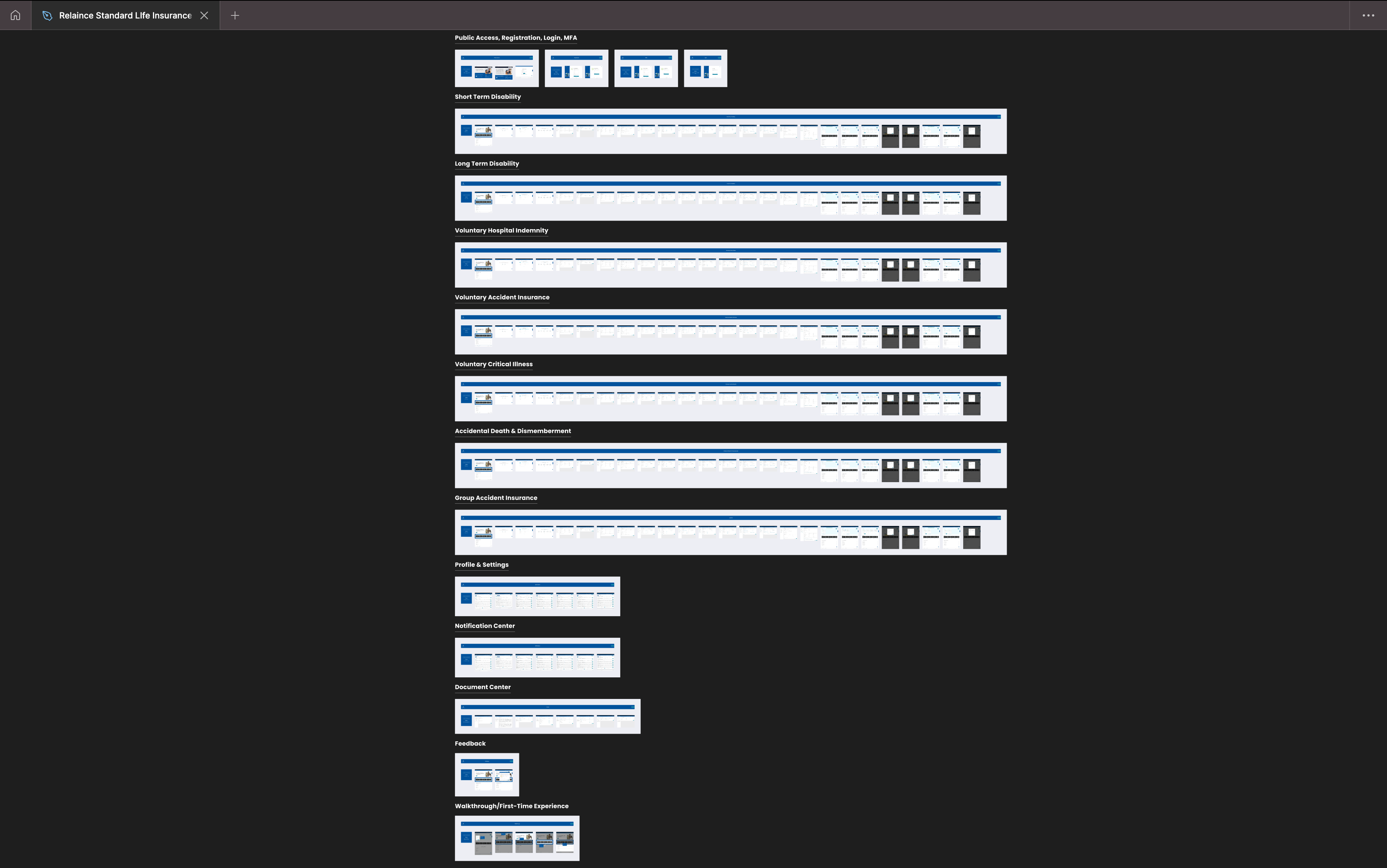
Insurance claims rely on heavy nuance across product types. We tested 2 insurance products during initial tests, and 4 products in beta. As a requirement for General Availability, all possible validations and edge cases, across all 7 insurance products had to be accounted for, in order for the product to be used in the real world. Only once all permutations were accounted for, and beta feedback in decline, did we roll out the new claims product to all 1M+ users.
Snapshot of Figma file showing all 7 insurance products released for GA.
The Final Design
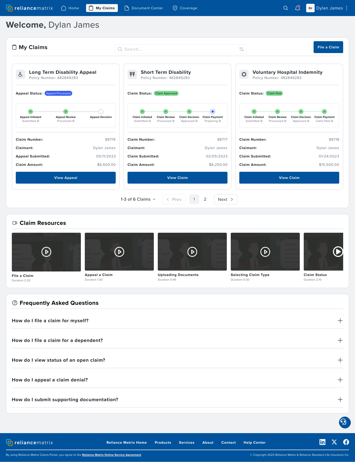
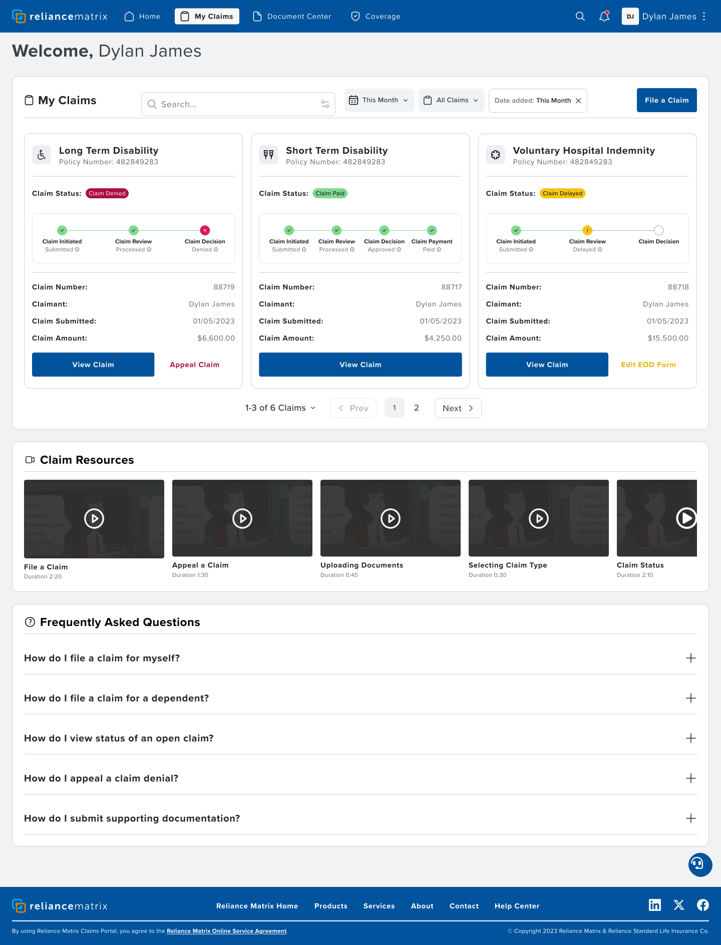
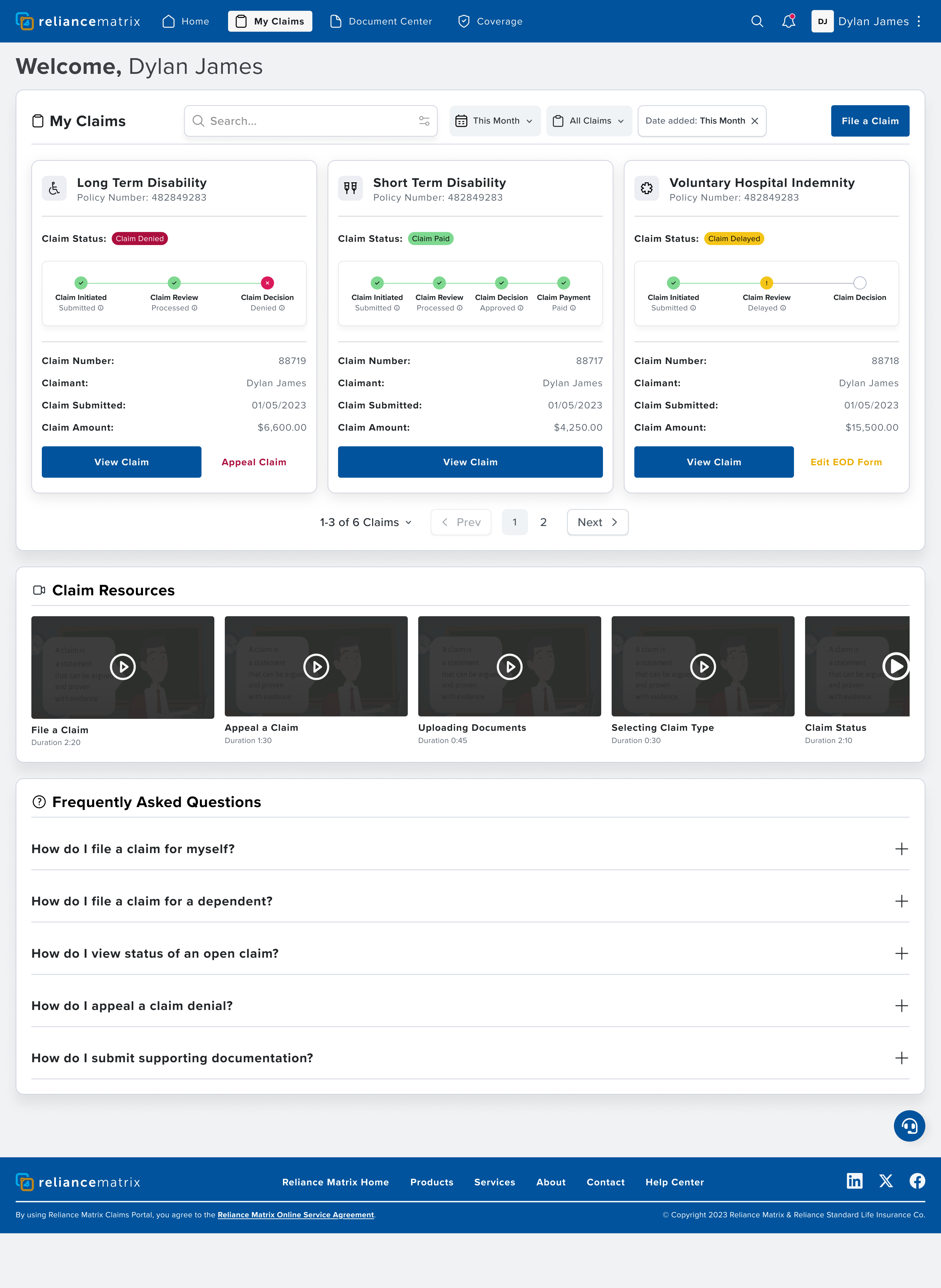
From the claims dashboard, Dylan can file, manage, view, and track all of his claims in real-time. Everything he needs is all available in a single pane, with all of the most important and relevant information available at a glance.
Guided Enablement
To support the user's request for more in-app resources, I worked with the business & enablement to create a comprehensive set of tools and guided walkthroughs.
Easy Appeals
Dylan can easily appeal a denied claim in minutes, instead of days, with just a couple of clicks. He has the ability to view and track his appeals, just like his claims, from the single dashboard view.
Authorize & Sign
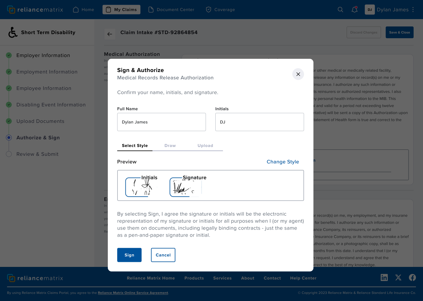
Dylan no longer has to provide a wet signature to file a claim, accept Reliance Matrix's HIPAA notice, or authorize his healthcare provider to release medical records to Reliance Matrix. This saves days to weeks on claim processing time.
Designing our own internal document signature tool also enabled us to sunset DocuSign as a third-party signing app, across the organization.
Document Center
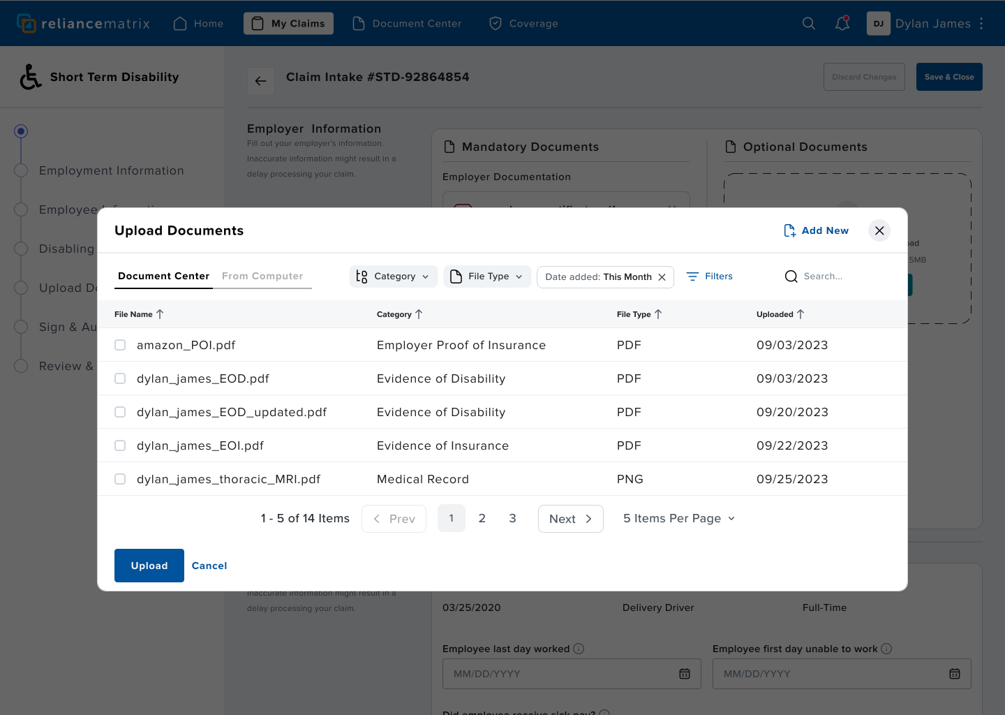
Dylan can use the document center to access documents he's previously uploaded, documents uploaded by Reliance Matrix, and documents uploaded by his health care provider. If he needs to file an additional claim, all of the documents he needs are easily accessible, without having to track down or re-upload anything.
Final Design
Claims Dashboard
Dylan has everything he needs to view both claims and appeals, and take needed actions, all from one single view on the My Claims page.