


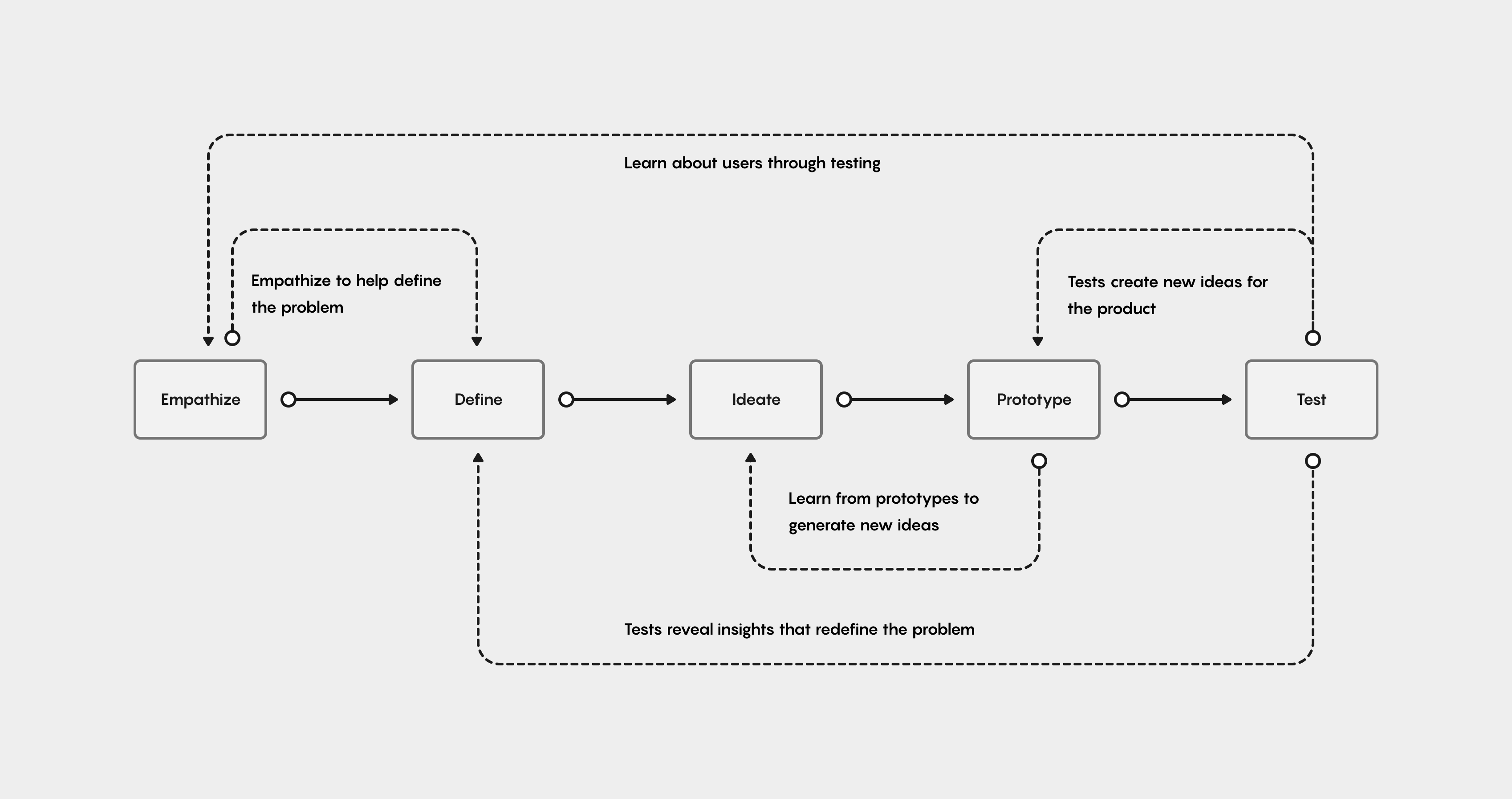
I typically use a combination of design thinking and design sprints. I try to be as flexible as possible in my process approach, so that the design team and I can be agile, and shift any time it's needed. For this project, I primarily leveraged design thinking.
Data Scientists & Machine Learning Engineers take massive amounts of data & create innovative, revenue-driving Machine Learning models.

I start off every design project with a practical research canvas to establish a clear purpose, set clear goals & measures of evaluation, to help define the problem space, to clearly identify initial assumptions, to lay-out hard deliverables, and to choose the appropriate research methods.
For the initial research for Andela Feature Store:
• Benchmarking usability test of the existing MVP to understand the current usability issues, and establish a basis of comparison for all subsequent iterations.
• Contextual inquiry & user interviews to help contextualize the 'why' & 'how' behind the usability issues, and to uncover additional user pain points.
• Interviews with internal stakeholders to understand & align on the business objectives & product metrics. To help with initial alignment between the design team & the business, I leveraged a set of existing product metrics and KPI's, initially set by the business.

I led my team through our research activities, and then led a design thinking workshop where we affinitized the data from our research observations & findings. We evaluated the findings, first on a per-user basis, then organized the insights into several core themes.
Below, are the core research themes that shaped the re-design of the Feature Store Product.

To bring-life to the core research themes, and drive user empathy within the team, I like to use Personas based on real users, Journey Maps, and Empathy Maps. The existing experience was riddled with friction points that caused users functional usability problems. These real-world problems were significant, & needed to remain consistently in-focus as the new experience was designed.
Using high fidelity research assets helps keep the bar for designcraft set high, and helps maintain stakeholders interest when used in the context of reports and presentations.
At the time we started working on Andela Feature Store, I had already launched our new design system. However, When auditing the existing Feature Store experience, & taking into account the initial components I knew we needed to build it out, we had about 50% of what we needed from the existing Andela Epic Design System.

50% is a lot on paper, but it was all in 5 core areas: the command line interface patterns, code snippet components, data visualization patterns, a new monospaced typeface, & an expanded color system.
When I looked at the upcoming product roadmap, I knew there were more machine learning products coming that would leverage a command line interface & code snippets, as well as additional big data products that could leverage a full library of visualizations.
I made the decision to approach these new components, patterns, and foundations, as full additions to the Epic Design System, as opposed to designing them from within the vacuum of a single product experience.
I chose PT Mono as the new monospaced typeface for the CLI & code snippets. I leveraged Andela's secondary brand palette, called 'productive', for the data visualization library. And finally, I worked with my lead product designer to create new code snippet components to deploy in the forthcoming command line interface design.
Based on the contextual inquiry and user interviews, I mapped out the mental model and process users actually use to build and deploy a machine learning model.
The moderated usability test enabled me to map out, & highlight the differences between the user's mental model & how the Feature Store experience forced them into a disparate process.
By mapping the two processes against each other, I was able to design a new user flow that aligned the user's actual feature building process, with a new flow for the experience.

Here's the original user flow which forced the user into a non-intuitive, circular progression through the experience.

Here's the updated, linearized user flow, which sets the stage for an aligned experience that helps the user maintain their cognitive footing and sense of place as they work their way through the experience.


Once the user flow had been linearized & aligned, the next design challenge was to ensure users could establish & maintain their sense of place as they work their way through the Feature Store experience.
My lead product designer was having trouble getting the feature workflow design started, so I worked one-on-one with her to sketch out four initial ideation points.
Those four key ideation points (seen in the sketch above) were:
• Bring in custom icons that are memorable, read true to the users, & act as signposts to establish the users sense of place when deployed in key areas throughout the interface.
• When a user clicks into a page for more detail, a panel pops out from the top of the page to ensure the context of the previous screen is kept in view. Breadcrumbs at the top of the screen reinforce this context, & also leverage the new icons, & help the user understand where they are within the experience, & take desired actions.
• Deploy the icons on the side navigation to act as a signpost for each workflow. Additionally we'd add an active tab indicator and bold text to remind the user of their current workflow.
• Finally, within the individual workflow itself, implement a tab group, again with bold text & an active tab indicator, to enable users to tab through each successive step in the feature process.


Since my lead product designer was still kickstarting building out individual screens for the feature workflow, I wanted to take some of the extra workload off her plate, & took on the custom icon design.
Data scientists use Andela Feature Store to execute abstract mathematical/statistical concepts. To make sure I was representing these concepts properly, I partnered with one of our data scientists, who was local to me. We met for coffee & had a co-design session to come up with 3D icons that work as visual metaphors for the abstract concepts.
One such abstract concept is a transformation. A transformation is a replacement that changes the shape of a distribution or relationship. The visual metaphor for transformation, seen above, is a glyph showing a transparent rectangle transforming into an opaque circle.

Here's the final design for the feature workflow. It makes use of the aforementioned icons, breadcrumbs, workflow indicators, and and workflow tab groups.

Here's a screenshot from the initial contextual inquiry. This shows how users were using the existing product.
Users had:
• One quadrant for the Feature Store Web UI.
• One quadrant for documentation.
• One quadrant for code editor/notepad.
• One quadrant for terminal/command line.
Users often had multiple command lines open, one for each workflow, and copied pieces of code from notepad to command line, & used the Web UI to view the end result of their processes. This was a core issue that led to many inefficiencies that needed to be resolved through a tight integration between the command line interface and Web UI.

The lead designer came up with these two initial wireframes for the integrated command line interface experience.
First, she tried making the CLI accessible from the side navigation (seen above left). But, that limited the users to a global CLI. From research I knew users could benefit from workflow-specific CLI's, so I suggested to the lead product designer that she place the CLI into each workflow (seen above right, in the Features workflow).
We also tried enabling the users to pop out & detach the CLI, but in testing, it led to the users popping out too many CLI instances, and we started seeing some of the same problems with the users getting lost as they worked through executing commands against different contexts or workflows in multiple windows.

Here's the final design for the command line interface. The CLI is integrated into each workflow as mentioned above. (The context of the CLI in the features workflow is pictured above.)
CLI Contexts
A key additional feature was enabling the users to tab between the different workflow contexts. This enabled the users to seamlessly switch between, for instance, the features CLI and transformation CLI to be able to quickly execute transformations that immediately impact feature creation. And, if the user fully transitions to the transformations workflow, the existing operations persist.
Autocomplete
Additionally, my final (personal) contribution to the CLI was pushing for autocomplete functionality. As I learned more about how and why machine learning engineers used code editors and code notepads, I strongly believed the experience needed to leverage autocomplete to minimize and/or eliminate the user's dependency on additional applications.
The autocomplete functionality is global, & pulls code from every context & workflow, on a historical basis. In a vast majority of scenarios, this enables the users to easily recall stored code snippets, & eliminates the users need to copy and paste code snippets from a secondary notepad.
This enabled a 60% reduction in time to create a new Machine Learning feature.
I worked with my data visualization designer to both achieve better, more robust designs for the existing visualizations, & also to work with the users to uncover additional visualizations that could either add value, context, or impact to the users, helping them achieve new insights in their workflow.
Below are a few examples of the new visualizations we created for the Feature Store experience.


Matrix charts compare two or more groups of elements within a single group. This visualizations helps Data Scientists identify how prediction information is related, & quickly assess the strength of those relationships.
The cohort analysis enables Data Scientists to view user data over a specified unit of time. This analysis helps to inform AT&T Data Scientists of specific insights needed to build a predictive model about future customer behavior.


Summarizing data with descriptive statistics or making inferences about parameters it is important to look at the data. It is hard to see any patterns by looking at a list of hundreds of numbers. Equally, a single descriptive statistic in isolation can be misleading and give the wrong impression of the data. A plot of the data is therefore essential.
Hexagonal binning is a technique that is commonly used in data science applications, to understand the spread of the dataset. It’s a richer alternative to a scatterplot chart. The technique of binning uses aggregation of data points as a method to group data points in a range or scale, that is represented by shapes like squares and hexagons (typically) and the color or saturation of these shapes represents the density of data points inside the range of these shapes. This makes it easier to identify clusters of data and can depict patterns or trends as well. The size of these shapes can be adjusted to analyze data at a micro or macro level.


Hexagonal binning is a technique that is commonly used in data science applications, to understand the spread of the dataset. It’s a richer alternative to a scatterplot chart. The technique of binning uses aggregation of data points as a method to group data points in a range or scale, that is represented by shapes like squares and hexagons (typically) and the color or saturation of these shapes represents the density of data points inside the range of these shapes. This makes it easier to identify clusters of data and can depict patterns or trends as well. The size of these shapes can be adjusted to analyze data at a micro or macro level.
To meet the needs of monitoring and visualizing a wide variety of big data, I designed a full data visualization library.


Polar, or `Radar' charts are a form of graph that allows a visual comparison between several quantitative or qualitative aspects of a situation, or when charts are drawn for several situations using the same axes (poles), a visual comparison between the situations may be made.
Polar, or `Radar' charts are a form of graph that allows a visual comparison between several quantitative or qualitative aspects of a situation, or when charts are drawn for several situations using the same axes (poles), a visual comparison between the situations may be made.


To meet the needs of monitoring and visualizing a wide variety of big data, I designed a full data visualization library.
The Sankey Diagram enables AT&T Data Scientists to view the complex flow of data through the Feature Store system, when there are less than 50 nodes involved.


A scatter plot (aka scatter chart, scatter graph) uses dots to represent values for two different numeric variables. The position of each dot on the horizontal and vertical axis indicates values for an individual data point. Scatter plots are used to observe relationships between variables.
Sunburst Chart — also known as Ring Chart, Multi-level Pie Chart, and Radial Treemap — is typically used to visualize hierarchical data structures.
Two key visualizations in the feature store experience are, Materializations (a type of data processing) and Performance Monitoring.
These two functions enable the users to successfully productionize a machine learning model, using the feature store.
The user uses the Materialized Feature Data visualization to first visualize data processing over time, then the user needs to be able to monitor the variables that affect how data reliability, data freshness, & data accuracy affect or impact the materializations, & then take corrective actions, if needed.

The screen above shows the Materialized Feature Data visualization. This bar chart displays the scheduling of materialization over time, & sets the stage for the Data Scientists to visualize the materialization's flow of data through the Andela Feature Store system.

In the original design, it wasn't possible for Data Scientists to switch between the materialization visualization & monitoring visualizations, they were exclusively built and launched through the command line, in two separate workflows.
The users needed the ability to seamlessly switch between materializations and monitoring, so they could view the critical functions that affect materialization processing.
The tab switching enables seamless and quick movement between the two visualizations, without losing the context of the feature being built.
Additionally, I believed it would be a good idea to give the users a set of the most common visualizations by default, so they didn't have to build or select them every time they start building a new feature. Using the dropdowns, the users can quickly call upon different sets of visualizations or change out a single visualization.
The most critical visualization that ties together the users process from end-to-end is the data-flow diagram. It helps users visualize and contextualize the flow of data through the feature store pipeline, from end-to-end.

The initial data-flow visualization made use of a traditional sankey diagram. Upon testing, the diagram worked fine for up to 20 nodes, but as the amount of nodes started scaling up, the sankey diagram started breaking down.
We needed a solution that could handle nodes that scaled well into the hundreds.

At this point, the design team was working hard, collaborating to create new design solutions for the data-flow visualization, but were unable to get past their initial block.
I put together a design thinking session, brought in the design team, the product manager, engineering team, & a few members from the data team to participate in a co-design session.
Together, we walked through a competitor analysis to see how other feature store applications had solved similar data-flow issues. Most had not, but a few tidbits of publicly available information helped me steer the initial direction. We looked at how Qwak and Amazon Sagemaker approached their data-flow diagram. This gave us a new direction from which to approach the data-flow challenge.
Once I had established the initial direction, I led exercises like design charettes and crazy 8's to build upon the new direction.
Since we had several users co-designing with us, I was able to build a quick prototype during a break, and conduct a cursory test on the spot, with actual users, in order to validate the design direction.

Here are a few early iterations of the new new data-flow diagram. We experimented with, & tested different styles of connector lines.
We also experimented with different ways to group the nodes by type, first leveraging a chip design to show when groups of nodes exceeded three.

Some users build workspaces that have hundreds of Data Sources, Feature Views, and Feature Services. The chip design turned out to not be a great way to show node groupings.
To manage nodes at this scale, I came up with an idea for a summary view that shows the node groupings, automatically, when zoomed out to 100% or more. The user can then adjust the zoom level closer, to automatically pop out of the grouped summary view.

Ater we tested the latest iteration of the data-flow diagram, users still felt the need for additional enahancements to contextualize how the data flows from end-to-end in the pipeline.
I came up with an idea to leverage subtle animations to illustrate how the data flows through the feature store pipeline.
Partnering closely with the Engineering team, it was clear, early on, that for large workspaces, animations needed to be disabled by default to improve browser performance. So the interface needed an easy way to toggle on and off the animations. To enable animations, the user clicks on the eye icon, animations begin, & the data-flow legend appears, showing the users what each animation means.
For example:
• When a Feature View has a materialization enabled, solid green animations will show where data is processed in batches & written to an Online feature store.
• A dotted green line animation shows where data is processed in streams & written to an online feature store.
• When a Feature Service has been configured, purple animations show offline retrieval flows.
Based on usability testing, these animations helped users understand & contextualize the full path of data through the system nearly twice as quickly as without the animations.

The last piece of the data flow diagram that enables users to understand complex data flow much quicker, is our approach to lineage tracing. The Dataflow diagram excels at helping the user understand lineage for every part of the feature pipeline.
When the user clicks on a node in the diagram, they are able to see all the dependencies upstream & downstream in the pipeline, & the nodes & connections that are non-dependencies are muted to the background.
This feature achieved a 70% reduction in the time it takes users to trace dependencies.
I design products & experiences that create outcomes & influence user behavior.


